Alerts are dynamic content that is injected into the page when it changes and a person using a screenreader needs to know that some state of the application has changed.
Use alerts sparingly.
If an alert is present on page load, it won’t be read automatically
If an element is present on page load, it is not technically an alert
The alert will be read by the screen reader when it becomes visible / appears in the DOM
Code examples
Basic notification
<divrole="alert"id="alert-notification"class="alert notification inert"><!--- Use JS to inject the alert here --></div><buttonid="show-alert-notification">
Save my settings
</button>
Error alert from an input field
<labelfor="favorite-nato-letter">
What is your favorite NATO letter?
<span>Required</span></label><divclass="description"id="favorite-nato-description">
Example: Alpha, Bravo, Charlie
</div><divrole="alert"id="favorite-nato-alert"class="alert inert"><!--- Do not reference this alert element
directly with aria-describedby --><divid="favorite-nato-error"><!--- Use JS to inject the alert here --></div></div><inputtype="text"id="favorite-nato-letter"aria-describedby="favorite-nato-error favorite-nato-description"required><buttonid="show-error">
Toggle error
</button>
Example: Alpha, Bravo, Charlie
Developer notes
Browser + screenreader quirks
Screenreaders do not implement alerts uniformly and must be tested
Just because an alert pattern works in one screenreader doesn’t mean it will work in all three
The element referenced by the aria-describedby attribute cannot use the role="alert" attribute (see example above for workaround).
NVDA will read the alert twice if it appears while the input is in focus: once from the role="alert" being injected and from the aria-describedby association.
NVDA needs a fraction of a second to catch up with changes in the DOM, use a setTimeout to delay displaying the alert
Name
Inner text describes alert when it appears on screen
Role
Use role="alert" for elements injected into the page
Focus
Focus does move to the element when the alert appears
Design notes
Perceivable
Type size is no smaller than 16px
The text has a 4.5:1 minimum contrast ratio
Color is not used as the only means of conveying information
Operable
The clickable/tappable target areas are no smaller than 44x44px
The focus indication has a minimum area equal to the width of the element and 2px in height
The focus state has a 3:1 minimum contrast ratio between the default and focused states
The focus indication has a 3:1 minimum contrast ratio against adjacent elements
Understandable
The alert purpose should be clear in the context of the whole page
Robust
Meets criteria across platforms, devices and viewports
Animation
Developer notes
Animations (like gifs) can be accessible if:
it automatically stops after 5 seconds or
if users are presented with an intuitive way to pause it
Code examples
Allow animations to be disabled with CSS
People with vestibular disorders can be made ill by sweeping animations on screen.
It is important to change or disable animations when device reduce motion settings are activated.
Technically autocomplete is the native browser action/attribute available for making suggestions for fields based on values people have previously entered or stored, like email, address or credit card information.
Autosuggest
Autosuggest is the correct terminology for this component that suggests what it thinks/hopes the user is searching for, but since most people call it autocomplete, we’ll just roll with it for the title.
Code examples
Custom listbox with autosuggest
Custom listboxes are notoriously difficult to build in an accessible fashion for screenreaders.
This simple native HTML example illustrates all the functionality of a listbox with inline autosuggest.
Support and functionality on mobile devices varies.
<labelfor="favorite-nato-text">
What's your favorite NATO letter?:
</label><inputid="favorite-nato-text"list="nato-letters"type="text"><datalistid="nato-letters"><optionvalue="Alpha"><optionvalue="Bravo"><optionvalue="Charlie"><optionvalue="Delta"><optionvalue="Echo"><optionvalue="Foxtrot"><optionvalue="Golf"><optionvalue="Hotel"><optionvalue="India"><optionvalue="Juliet"><optionvalue="Kilo"><optionvalue="Lima"><optionvalue="Mike"><optionvalue="November"><optionvalue="Oscar"><optionvalue="Papa"><optionvalue="Quebec"><optionvalue="Romeo"><optionvalue="Sierra"><optionvalue="Tango"><optionvalue="Uniform"><optionvalue="Victor"><optionvalue="Whiskey"><optionvalue="X-ray"><optionvalue="Yankee"><optionvalue="Zulu"></datalist>
Breadcrumb navigation
Code example
<navclass="breadcrumbs"aria-label="Breadcrumb"><ol><li><ahref="/">
Home
</a></li><li><ahref="/web/"aria-label="Web accessibility checklist">
Web
</a></li><li><ahref="/accessible-web/breadcrumbs/"aria-current="page">
Breadcrumbs
</a></li></ol></nav>
Developer notes
Breadcrumb link names must correspond to their destination page titles.
In the example here, the “Web” link uses an aria-label that corresponds to the full title of the destination page.
Use a <nav> with a unique name like aria-label=”breadcrumbs”
Placing the links inside <ol> and <li> provides context to users about a given breadcrumb’s position in a list and of the total number of breadcrumbs.
Add aria-current="page" to the last link in the breadcrumb. This represents the current item within a container or set of related elements.
This semantic HTML looks like a link, but it is still a button.
<buttonclass="inline">
Continue
</button>
Fully disabled button
A button that uses the disabled attribute will not be focusable, but it is still discoverable by the screen reader while browsing.
<buttondisabled>
Continue
</button>
Focusable disabled button
When a button isn’t ready to submit a form yet, but can still be clicked, use aria-disabled="true" to increase perceivability for people using a screen reader. Ex: Clicks submit and is notified of errors in the form.
<buttonaria-disabled="true">
Continue
</button>
When you can’t use semantic HTML
This custom button requires extra attributes and JS event listeners. Adding tabindex="0" makes it focusable.
<divrole="button"tabindex="0">
Continue
</div>
Avoid icon buttons
Buttons with no visible text (icon only) are inadvisable.
Use your words
You can think of words like a group of symbols that mean things.
When using an icon with no text is unavoidable, DO NOT rely on the alt attribute for the button name.
As a last resort, aria-label can be used.
aria-label will (typically) replace the inner text of the button for the screen reader output.
<buttonaria-label="Get my location"><!-- icon goes here --></button>
Based on Google's Material design, you can define your accessibility criteria for cards on Android devices
<h2>
Card testing criteria
</h2><divclass="cards"><divclass="card interactive"><divclass="card-content"><aclass="category"href="/design/">Design</a><h3class="h-charlie"><aclass="title"href="/accessible-design/card/">Card box design criteria</a></h3><p>
Base your design on WCAG's POUR principles or design experiences by disability
</p></div></div><divclass="card interactive"><divclass="card-content"><aclass="category"href="/web/">Web</a><h3class="h-charlie"><aclass="title"href="/accessible-web/card/">Web card box criteria</a></h3><p>
Based on WCAG success criteria, you can define your accessibility criteria for cards on the Web
</p></div></div><divclass="card interactive"><divclass="card-content"><aclass="category"href="/ios/">iOS</a><h3class="h-charlie"><aclass="title"href="/accessible-ios/card/">iOS card box criteria</a></h3><p>
Based on Apple's Human Interface Guidelines, you can define your accessibility criteria for cards on iOS apps
</p></div></div><divclass="card interactive"><divclass="card-content"><aclass="category"href="/android/">Android</a><h3class="h-charlie"><aclass="title"href="/accessible-android/card/">Android card box criteria</a></h3><p>
Based on Google's Material design, you can define your accessibility criteria for cards on Android devices
</p></div></div></div>
Carousel slideshow
Code examples
Use semantic HTML
This is one example of an accessible carousel wizard.
It is not the only way to build a carousel, but it meets all the critieria:
The group has a name
New slides titles are announced
Arrow keys advance the slides
<sectionclass="carousel"aria-label="Slideshow"><divclass="carousel-banner"><h2class="carousel-title"id="carousel-title">
NATO alphabet
</h2><divclass="carousel-nav"role="group"aria-label="Slide controls"><buttonclass="previous"><spanclass="hidden">Back slide</span></button><buttonclass="next"><spanclass="hidden">Next slide</span></button></div></div><divclass="slide-list"role="group"aria-labelledby="carousel-title"aria-live="polite"><divrole="group"class="slide visible"aria-labelledby="slide-heading-1"tabindex="-1"><h3id="slide-heading-1"class="h-charlie">
Alpha/Alfa
<spanclass="position">1 of 7</span></h3><p>
Pronounced al fah
</p><buttonclass="next">
Start
</button></div><divrole="group"class="slide inert"aria-labelledby="slide-heading-2"tabindex="-1"><h3id="slide-heading-2"class="h-charlie">
Bravo
<spanclass="position">2 of 7</span></h3><p>
Pronounced brah voh
</p><buttonclass="previous in-slide">
Back
</button><buttonclass="next">
Next
</button></div><divrole="group"class="slide inert"aria-labelledby="slide-heading-3"tabindex="-1"><h3id="slide-heading-3"class="h-charlie">
Charlie
<spanclass="position">3 of 7</span></h3><p>
Pronounced char lee
</p><buttonclass="previous in-slide">
Back
</button><buttonclass="next">
Next
</button></div><divrole="group"class="slide inert"aria-labelledby="slide-heading-4"tabindex="-1"><h3id="slide-heading-4"class="h-charlie">
Delta
<spanclass="position">4 of 7</span></h3><p>
Pronounced dell tah dell tah dell tah. Can I help yah help yah help yah?
</p><buttonclass="previous in-slide">
Back
</button><buttonclass="next">
Next
</button></div><divrole="group"class="slide inert"aria-labelledby="slide-heading-5"tabindex="-1"><h3id="slide-heading-5"class="h-charlie">
Echo
<spanclass="position">5 of 7</span></h3><p>
Pronounced eck oh
</p><buttonclass="previous in-slide">
Back
</button><buttonclass="next">
Next
</button></div><divrole="group"class="slide inert"aria-labelledby="slide-heading-6"tabindex="-1"><h3id="slide-heading-6"class="h-charlie">
Foxtrot
<spanclass="position">6 of 7</span></h3><p>
Pronounced foks trot
</p><buttonclass="previous in-slide">
Back
</button><buttonclass="next">
Next
</button></div><divrole="group"class="slide inert"aria-labelledby="slide-heading-7"tabindex="-1"><h3id="slide-heading-7"class="h-charlie">
Golf
<spanclass="position">7 of 7</span></h3><p>
Pronounced golf
</p><buttonclass="previous in-slide">
Back
</button></div></div></section>
NATO alphabet
Alpha/Alfa
1 of 7
Pronounced al fah
Bravo
2 of 7
Pronounced brah voh
Charlie
3 of 7
Pronounced char lee
Delta
4 of 7
Pronounced dell tah dell tah dell tah. Can I help yah help yah help yah?
Echo
5 of 7
Pronounced eck oh
Foxtrot
6 of 7
Pronounced foks trot
Golf
7 of 7
Pronounced golf
Chat
Chat comes in multiple flavors
Whole page AI / LLM tools
Popup windows
Injected widgets
Common features and requirements
It’s impossible to sum up every possible acceptance criteria for every variety of chat, but they all contain a mashup of components, each of which must be accessible.
<fieldset><legend>Choose your favorite NATO letters:</legend><inputtype="checkbox"id="alphaCheckbox"><labelfor="alphaCheckbox">Alpha</label><inputtype="checkbox"id="bravoCheckbox"><labelfor="bravoCheckbox">Bravo</label><inputtype="checkbox"id="charlieCheckbox"aria-describedby="charlieCheckboxDescription"checked><labelfor="charlieCheckbox">Charlie</label><divclass="description"id="charlieCheckboxDescription">
Charlie is everyone's favorite
</div></fieldset>
Don’t put interactive elements inside the label
Even though this is valid HTML, it creates unpredictable results with screenreaders. A (currently) reliable method is to keep interactive elements outside the label and reference it with aria-describedby="description-id"
<fieldset><legend>Legal disclaimers</legend><divid="description-tc"class="description-checkbox"><ahref="/code-of-conduct/">Read terms and conditions</a></div><inputtype="checkbox"id="tc-agree"aria-describedby="description-tc"><labelfor="tc-agree">
I agree to the terms and conditions
</label></fieldset>
Fully disabled checkbox
An input using disabled will not be focusable with the tab key
Arrow keys will still be able to browse disabled inputs
<fieldset><legend>Choose the starcrossed NATO letters</legend><inputtype="checkbox"id="romeoCheckbox"disabledchecked><labelfor="romeoCheckbox">Romeo</label><inputtype="checkbox"id="julietCheckbox"disabled><labelfor="julietCheckbox">Juliet</label></fieldset>
Disabled and focusable checkbox
It’s possible to use aria-disabled="true" so screen reader users can focus the checkbox. Use preventDefault() to prevent the checkbox from being checked.
<fieldset><legend>Choose your favorite cities</legend><inputtype="checkbox"id="limaCheckbox"aria-disabled="true"checked><labelfor="limaCheckbox">Lima</label><inputtype="checkbox"id="quebecCheckbox"aria-disabled="true"><labelfor="quebecCheckbox">Quebec</label></fieldset>
When you can’t use semantic HTML
This custom checkbox requires extra attributes and event listeners.
Sometimes a design may call for a card type checkbox.
Its core should still be a semantic checkbox input
Use aria-describedby to read extra content after the the name, role and state
<ulclass="cards"><liclass="card interactive"><inputtype="checkbox"id="deltaCheckboxCard"aria-describedby="descriptionDelta"><labelfor="deltaCheckboxCard">
Delta
</label><divclass="extended-description"id="descriptionDelta">
Delta (prounounced: <strong>dell</strong>-tah)
is the fourth letter of the NATO alphabet.
</div></li><liclass="card interactive"><inputtype="checkbox"id="echoCheckboxCard"aria-describedby="descriptionEcho"><labelfor="echoCheckboxCard">Echo</label><divclass="extended-description"id="descriptionEcho">
Echo (prounounced: <strong>eck</strong>-oh)
is the fifth letter of the NATO alphabet.
</div></li></ul>
Delta (prounounced: dell-tah)
is the fourth letter of the NATO alphabet.
Echo (prounounced: eck-oh)
is the fifth letter of the NATO alphabet.
Developer notes
Name
label text must describe the checkbox input.
Use aria-describedby="description-id" for hints or additional descriptions
aria-label="Checkbox input purpose" can also be used (as a last resort)
Role
By default, semantic HTML checkbox inputs identify as a checkbox
Use role="checkbox" for custom elements
Group
Semantic HTML
<fieldset> wraps a checkbox group
<legend> describes the group’s purpose
Each <label> must include for="input-id" to be associated with its input
Custom elements
Use role="group" in the place of fieldset
Use aria-labelledby="label-id" to associate an element as a label
aria-label="Group purpose" can also be used if there’s no label with an ID
State
Semantic HTML
Use checked for native HTML
Use the disabled state for inactive checkboxes
Custom element
Use aria-checked="true/false" to express state
Use aria-disabled="true" to declare inactive elements
Focus
Focus must be visible
Custom elements will require keyboard event listeners
An accessible date picker will have the following components:
Launch button
Opens the date picker
Focus returns to this button on closing the popup dialog
Date picker popup dialog
The dialog itself should be labelled by the month and year with aria-labelledby="month-year-heading-id"
Use aria-live="polite" for the dialog, aria-live="polite" for month/year heading
Calendar navigation buttons
Use aria-label="Previous" and aria-label="Next" to name the buttons.
Date grid table
Use aria-labelledby="month-year-heading-id" to label the table
Date picker buttons
Use aria-selected="true" to indicate state
Decorative image / icon
Decorative images
There are times that images shouldn’t be read because it would be repetitive or not add any value in addition to the existing page content. These types of images are generally included for purely stylistic purposes and don’t impart any meaning to the rest of the content on the page.
Icon buttons
When it’s unavoidable to use an icon button (no text label) DO NOT rely on image alt text to supply the name for a icon button.
Is this image decorative or informative?
If the image conveys important meaning, and there’s no other text on the page which explains the concept within it, then the image is likely informative. In this case, check out the informative image checklist item instead.
If your image contains text inside it, it should not! This is a violation of WCAG AA 1.4.5 Images of Text. Exceptions exist for logos.
The alt attribute is still required
To have valid HTML, the alt attribute must still be present, even when set to the empty empty value of alt. Note that alt and alt="" (no space) are equivalent in HTML.
When the alt attribute is empty, the screen reader ignores it (and will not read anything).
When the alt attribute is missing, the screen reader will read the src name or filename of the image which is a very poor user experience.
Reinforce decorative images with aria-hidden
Use aria-hidden="true" as a backup and reinforcement to alt:
Backup: developers often mistakenly omit the alt attribute entirely, meaning that some screenreaders will read the entire filename without an alt attribute. Including aria-hidden="true" will act as a backup.
Reinforcement: using aria-hidden="true" ensures that screenreaders ignores the image. Screenreaders have been observed reading an image role even when the alt attribute is empty.
<h3class="h-charlie decorated"><imgsrc="/assets/images/icons/icon-info.svg"aria-hidden="true"class="icon"alt/>
Your plan might be changing soon
</h3><ahref="tel:8888888888"class="button icon-button-text"><imgsrc="/assets/images/icons/icon-phone.svg"aria-hidden="true"class="icon"alt/>
Call us: 888-888-8888
</a>
Using inline SVG
Inline SVG that is decorative
Inline SVGs require some special code to be hidden properly from screen readers:
aria-hidden="true"
If you are using a <use /> element, add aria-hidden="true".
<svgaria-hidden="true"focusable="false"><usehref="#svg-id"aria-hidden="true"/><!-- if not using <use> then the child elements
of the inline SVG would go here --></svg>
Alerts are functionally similar to a modal dialog. The primary difference is that an alert may not have a dedicated close button, and require people to take a specific action to dismiss (ex: Are you sure you want to delete your account? Yes / No).
<buttonid="showModal">
Delete my account
</button><dialogrole="dialog"id="modal"tabindex="-1"aria-modal="true"aria-labelledby="dialog-title"><divclass="dialog-content"><h2id="dialog-title"class="h-bravo">
Delete my account
</h2><p>
Are you sure you want to permanently delete your account? This cannot be undone.
</p><buttontype="button"id="closeModal"class="menu">
No, go back
</button><buttontype="button"class="menu danger">
Yes, delete my account
</button></section></dialog>
Do not use the Popover API to launch dialog modals
The Popover API cannot be used to launch a dialog modal. The Popover element will not have the same semantics or built in features of a JS launched using modal.showModal();
Do not brute force inert content
Don’t apply tabindex="-1" or aria-hidden="true" to inert content beneath the dialog.
Just use <dialog> with modal.showModal(); to launch it. This will solve practically all of your problems in life.
Required attributes & actions
Launch button
Should be a button, not a link
Upon closing, focus must return to the button that launched the dialog
Do not usearia-haspopup. This attribute has very low and support and unpredictable output across screen readers.
Name
The modal window has a meaningful descriptive name from either:
aria-label="Modal title" or
aria-labelledby="heading-id" pointing to an <h2> as a title
Role
Use role="dialog" so the screen reader can identify this as a dialog or modal
Group
Upon closing, focus must return to the button that launched the dialog
State
Use aria-modal="true" to indicate content beneath the modal is inert and that the screen reader must not browse outside the dialog.
Focus
Use tabindex="-1" to make the modal itself targetable for focus
This is a helpful pattern because not every modal has a dismiss button (ex: Alert options for being signed out if user is inactive)
Upon closing, focus must return to the button that launched the dialog
Screenreader differences
NVDA
By default, NVDA may read the entire modal upon launch. This is expected behavior.
iOS Voiceover
Voiceover will place focus on the first focusable control, no matter what JS targets for focus
Code examples
Dialog using JS
<buttonid="showModal">
Things you should know
</button><dialogrole="dialog"id="modal"tabindex="-1"aria-modal="true"aria-labelledby="dialog-title"><buttontype="button"id="closeModal"class="close"><spanclass="hidden">Close</span></button><divclass="dialog-content"><h2id="dialog-title"class="h-bravo">
Things you should know
</h2><h3>Keyboard</h3><ul><li>Focus must not enter the rest of the page.</li><li>The escape key must close the modal.</li></ul><h3>Screenreader</h3><ul><li>The modal's title is announced on launch.</li><li>The screen reader cannot read content behind the dialog.</li></ul><buttontype="submit">
Continue
</button></section></dialog>
Dialog sheet
A sheet dialog is a modal dialog
Sheets are functionally the same as a modal dialog. The only reason there’s an entry for this is because people call it a sheet.
<buttonid="showModal">
Things you should know
</button><dialogrole="dialog"id="modal"tabindex="-1"aria-modal="true"aria-labelledby="dialog-title"class="bottom-sheet"><buttontype="button"id="closeModal"class="close"><spanclass="hidden">Close</span></button><divclass="dialog-content"><h2id="dialog-title"class="h-bravo">
Things you should know
</h2><h3>Keyboard</h3><ul><li>Focus must not enter the rest of the page.</li><li>The escape key must close the modal.</li></ul><h3>Screenreader</h3><ul><li>The modal's title is announced on launch.</li><li>The screen reader cannot read content behind the dialog.</li></ul><buttontype="submit">
Continue
</button></section></dialog>
Dynamic single page app
How does dynamic aria-live content work?
Inconsistently: You may experience differences in expected behavior
The screenreader expects content within an element with a aria-live="polite" attribute to change
By default, only the content that has changed will be read
To force the screenreader to read all contents even if it did not change within the element, add aria-atomic="true"
Rarely must you use aria-live="assertive" as it (is intended to) override every other message from the screenreader
About alerts
By default an element using role="alert" has aria-live="assertive"
Focus management & consistency
For actual single page apps:
Focus must be deliberately and consistently placed at the
top of new page content or
top of the HTML page
DO NOT place focus on the first input on page load
Code example
aria-live="polite" announces only newly injected content after other messages
aria-live="polite" aria-atomic="true" announces all injected content after other messages
aria-live="assertive" container announces only newly injected content before other messages
aria-live="assertive" aria-atomic="true" announces all injected content before other messages
role="alert" aria-atomic="true" announces all injected content before other messages (like aria-live="assertive")
role="status" aria-atomic="true" announces all injected content after other messages (like aria-live="polite")
Injected content
<divclass="dynamic-app"><p><code>aria-live="polite"</code> announces only newly injected content after other messages</p><olclass="dynamic-content"aria-live="polite"aria-atomic="false"></ol><buttontype="button"onclick="showContent()">Update content</button></div><divclass="dynamic-app"><p><code>aria-live="polite" aria-atomic="true"</code> announces all injected content after other messages</p><olclass="dynamic-content"aria-live="polite"aria-atomic="true"></ol><buttontype="button"onclick="showContent()">Update content</button></div><divclass="dynamic-app"><p><code>aria-live="assertive"</code> container announces only newly injected content before other messages</p><olclass="dynamic-content"aria-live="assertive"aria-atomic="false"></ol><buttontype="button"onclick="showContent()">Update content</button></div><divclass="dynamic-app"><p><code>aria-live="assertive" aria-atomic="true"</code> announces all injected content before other messages</p><olclass="dynamic-content"aria-live="assertive"aria-atomic="true"></ol><buttontype="button"onclick="showContent()">Update content</button></div><divclass="dynamic-app"><p><code>role="alert" aria-atomic="true"</code> announces all injected content before other messages (like aria-live="assertive")</p><olclass="dynamic-content"role="alert"aria-atomic="true"></ol><buttontype="button"onclick="showContent()">Update content</button></div><divclass="dynamic-app"><p><code>role="status" aria-atomic="true"</code> announces all injected content after other messages (like aria-live="polite")</p><olclass="dynamic-content"role="status"aria-atomic="true"></ol><buttontype="button"onclick="showContent()">Update content</button></div><template><li>Injected content</li></template><script>functionshowContent(){lettemp=document.getElementsByTagName("template")[0];letclone=temp.content.cloneNode(true);event.target.parentNode.querySelector('.dynamic-content').appendChild(clone);}</script>
Expander accordion
Code examples
Use semantic HTML
This semantic HTML contains all accessibility features by default with no scripting required.
It uses CSS pseudo attributes to create the expanded/collapsed indicator, no Javascript.
<details><summary>
About the NATO alphabet
</summary>
The (International) Radiotelephony Spelling Alphabet,
commonly known as the NATO phonetic alphabet,
is the most widely used set of clear code words
for communicating the letters of the Roman alphabet.
</details>
About the NATO alphabet
The (International) Radiotelephony Spelling Alphabet,
commonly known as the NATO phonetic alphabet,
is the most widely used set of clear code words
for communicating the letters of the Roman alphabet.
Use semantic HTML where possible
This custom expander uses a semantic button with aria-expanded with additional scripting to toggle content and states.
<divclass="expander-group"><buttonclass="expander-toggle"aria-expanded="false">
About the NATO alphabet
</button><divclass="expander-content">
The (International) Radiotelephony Spelling Alphabet,
commonly known as the NATO phonetic alphabet,
is the most widely used set of clear code words
for communicating the letters of the Roman alphabet.
</div></div>
The (International) Radiotelephony Spelling Alphabet,
commonly known as the NATO phonetic alphabet,
is the most widely used set of clear code words
for communicating the letters of the Roman alphabet.
Developer notes
Name
Inner text must describe the purpose
Role
<details> identifies as details
Native button identifies as button by default
Use role="button" for custom elements
Group
You can use aria-controls="popupId", but it is not well supported
State
Menus or expanders use aria-expanded="true/false"
Focus
Focus must be visible
Design notes
Nielsen Norman Group study: The caret icon most clearly indicated to users that it would open an accordion in place, rather than linking directly to a new page.
Not all users will notice there is hidden content or understand how these work. For this reason, you should only use them in specific situations and if user research supports it.
FAQ
Code and design examples
We don’t use FAQ
<nope><strong>We don't use FAQ.</strong></nope>
Why don’t we use FAQ?
If there is important content that is required to understand the UI, the FAQ is a sub optimal approach to helping the user.
FAQs are a terrible experience for everyone
If your app is so difficult to understand, invest in better UX copywriting and put detailed information where people originate questions, rather than a central mystery meat FAQ page
Place information where people have questions
About the NATO alphabet
The (International) Radiotelephony Spelling Alphabet,
commonly known as the NATO phonetic alphabet,
is the most widely used set of clear code words
for communicating the letters of the Roman alphabet.
Typical FAQ
Most FAQ are full of questions you wish the customer would ask, rather than anything helpful in completing tasks
What is our product?
Lorem ipsum dolor sit amet, consectetur adipiscing elit.
Sed do eiusmod tempor incididunt ut labore et dolore magna aliqua.
How can I purchase it?
Lorem ipsum dolor sit amet, consectetur adipiscing elit.
Sed do eiusmod tempor incididunt ut labore et dolore magna aliqua.
Can I purchase a premium version?
Lorem ipsum dolor sit amet, consectetur adipiscing elit.
Sed do eiusmod tempor incididunt ut labore et dolore magna aliqua.
Does the product come in different colors?
Lorem ipsum dolor sit amet, consectetur adipiscing elit.
Sed do eiusmod tempor incididunt ut labore et dolore magna aliqua.
Can I purchase a gift card?
Lorem ipsum dolor sit amet, consectetur adipiscing elit.
Sed do eiusmod tempor incididunt ut labore et dolore magna aliqua.
Can I just send you money?
Lorem ipsum dolor sit amet, consectetur adipiscing elit.
Sed do eiusmod tempor incididunt ut labore et dolore magna aliqua.
Filter
Code example
Do not apply aria-live to entire contents of the results (unless the returned information is always brief)
Do not move focus to the search results
Results use an unordered list <ul><li>, reinforcing the number and structure of results for people using a screen reader
The results summary uses aria-live="polite" and aria-atomic="true" to announce the entire summary on changes
<divclass="filter-container"><formid="categoryForm"aria-label="Filter Web criteria"><fieldset><legend>
Filter Web criteria
</legend><inputtype="radio"name="category"value="header"id="header"checked><labelfor="header">Header</label><inputtype="radio"name="category"value="nav"id="navigation"><labelfor="navigation">Nav</label><inputtype="radio"name="category"value="main"id="main"><labelfor="main">Main</label><inputtype="radio"name="category"value="footer"id="footer"><labelfor="footer">Footer</label></fieldset></form><divclass="filter-results"><divaria-live="polite"aria-atomic="true"><h3id="resultsCount"><!-- Results summary injected here --></h3></div><ulid="results"><!-- Results injected here --></ul></div></div>
Footer / contentinfo landmark
Code examples
Use semantic HTML
This semantic HTML contains all accessibility features by default.
Note: Because the superscript footnote link is inline with paragraph text, there is no requirement for a minimum clickable/tappable area, however in this case, a CSS pseudo element has been used to do so.
<p>
People definitely read footnotes and find them helpful.
<aclass="footnote-link"id="ref-alpha-link"href="#ref-alpha"><sup>
1
<spanclass="hidden">Footnote details</span></sup></a></p><divclass="vertical-spacer"></div><pclass="footnote"id="ref-alpha"tabindex="-1">
1. That is not true. Nobody reads footnotes.
<ahref="#ref-alpha-link">Back to content</a></p>
For long forms, it can be helpful to list all errors in an alert with links back to individual invalid inputs on each attempt to submit
UX guidance
Affordance: field width indicates the expected input
Form field width should afford the user space to enter the characters that will be required. Do not arbitrarily limit the width of names, usernames, passwords or emails.
Practical examples
Middle initial should be wide enough to accommodate 1 character
State abbreviations should be wide enough to accommodate 2 characters
Zip code must be wide enough to accommodate 5 characters
Pin numbers reflect the number of digits expected
Why we stack inputs
Do not put forms in multiple columns.
People are accustomed to scrolling vertically. There is no advantage to making the page take up less vertical space.
People with low vision may be using a zoom tool, enlarging the view of their screen and thus only seeing a portion of the form. If there is a column on the right side, it will be difficult to discover the fields.
Do not place submit buttons in a sidebar unless there is also a submit button at the bottom of the form
Why we use autocomplete
Autocomplete is helpful for all customers leading to a speedier conversion
For those with motor disabilities, it eliminates the need to laboriously enter information
Code examples
Use semantic HTML
<formaria-label="Sign in"><fieldset><legend>
Sign in
</legend><labelfor="username">
Username
</label><inputtype="text"id="username"><buttontype="submit">
Sign in
</button></fieldset></form>
Credit card information
This form uses minimal unobtrusive masking to make the credit card number more readable. (When done poorly, masking can can cause the field to be read repeatedly as the mask refreshes)
Autofill attributes to help customers complete fields with less effort.
Using inputmode="numeric" brings up the numeric keyboard on mobile devices making entry easier.
Header / banner landmark
General notes
There must only be a one singular header/banner element on the page.
Contains site title and typically the primary navigation.
Code examples
Use semantic HTML
This semantic HTML contains all accessibility features by default.
<headerid="example-header"><ahref="#nav-example">Skip to navigation</a><ahref="#">Not the navigation</a><navtabindex="-1"class="nav-example"id="nav-example"><ul><li><ahref="/">Home</a></li><li><ahref="/about/">About</a></li><li><ahref="/contact/">Contact</a></li><li><button>Sign in</button></li></ul></nav></header>
This allows the preservation of good heading structure and flexibility in design
<h1class="text-display-medium">
Shop
</h1><h2class="text-display-huge">
Our biggest coffee sale of the year
</h2><h3class="text-display-large">
Light roast liquidations
</h3><h3class="text-display-large">
Medium roast markdowns
</h3><h3class="text-display-large">
Dark roast deals
</h3>
When you can’t use semantic HTML
This custom header requires extra attributes.
<divrole="heading"aria-level="1">
About our company
</div>
Hint, help, or error
Code examples
Adding hint/help text
<labelfor="best-nato-letter">
The best NATO letter is:
</label><divclass="description"id="best-nato-letter-description">
Example: Alpha, Bravo, Charlie
</div><inputtype="text"id="best-nato-letter"aria-describedby="best-nato-letter-description">
Example: Alpha, Bravo, Charlie
Adding an error
Note: The alert must be structured as below to function properly in VoiceOver, with the alert text nested inside the role="alert" element.
<labelfor="favorite-nato-letter">
What is your favorite NATO letter?
<span>Required</span></label><divclass="description"id="favorite-nato-description">
Example: Alpha, Bravo, Charlie
</div><divrole="alert"id="favorite-nato-alert"class="alert inert"><!--- Do not reference this alert element
directly with aria-describedby --><divid="favorite-nato-error"><!--- Use JS to inject the alert here --></div></div><inputtype="text"id="favorite-nato-letter"aria-describedby="favorite-nato-error favorite-nato-description"required><buttonid="show-error">
Toggle error
</button>
Example: Alpha, Bravo, Charlie
When there is no hint or alert
Using aria-describedby with a uniqueID that doesn’t exist on page yet will generate errors in automated syntax checking tools.
If it’s not possible to remove the attribute, there are ways to avoid the error flag.
Option 1: Leave aria-describedby="" empty until the hint exists (preferred)
This is preferred because the DOM is cleaner.
<labelfor="favorite-pickle">
What is your favorite pickle?
</label><inputtype="text"id="favorite-pickle"aria-describedby=""><!-- Leave aria-describedby attribute empty -->
Option 2: Leave the empty hint element in the DOM
This technique shouldn’t have any significant side effects, but does leave surplus elements in the DOM which is gross.
<labelfor="favorite-snack">
What is your favorite healthy snack?
</label><inputtype="text"id="favorite-snack"aria-describedby="description-favorite-snack"><divclass="description"id="description-favorite-snack"><!-- Leave the description element empty --></div>
Developer notes
Browser + screenreader quirks
Screenreaders do not implement alerts uniformly and must be tested
Just because an alert pattern works in one screenreader doesn’t mean it will work in all three
The element referenced by the aria-describedby attribute cannot use the role="alert" attribute (see example above for workaround).
NVDA will read the alert twice if it appears while the input is in focus: once from the role="alert" being injected and from the aria-describedby association.
NVDA needs a fraction of a second to catch up with changes in the DOM, use a setTimeout to delay displaying the alert
Informative image
Is this image decorative or informative?
If the image conveys meaning, and there’s no other text on the page which explains the content within it, then the image is likely informative.
If the image is included for purely stylistic purposes and doesn’t impart any meaning to the rest of the content on the page, then the image is likely decorative. In this case, check out the decorative image checklist instead.
What about lifestyle images or stock photos?
Lifestyle images of attractive people are informative because they are intended associate the product with the beautiful and successful looking people featured in the image. As it turns out, people with disabilities are beautiful and successful too.
Text inside the image
If your design involves images of text, stop. There’s almost certainly a way to accomplish your particular design with CSS and web typefaces.
Exceptions exist for logos or when the presentation of the text requires it to be an image.
What about logos?
Logo graphics should be named by what it represents, NOT what it is.
For example, the Apple logo on Apple.com doesn’t represent an apple logo. It represents Apple, the organization. Consider that when the image is used to name a link to the home page, alt="Apple Logo" is no longer descriptive of the link.
Bad logo example
<imgsrc="/assets/images/icons/logo-apple.svg"alt="A flat minimalistic apple
designed as a black icon with a
bite taken out of the right side
and a single leaf on top leaning
the right">
If you were describing the image to someone via phone conversation and they couldn’t see what you were looking at, what would you say?
<imgsrc="/farm.jpg"alt="Rustic barn surrounded by rolling hills"/>
Using inline SVG
Inline SVG that conveys meaning
Inline SVGs require some special code to be read consistently in all screenreaders:
Name: either aria-label or <title />
Role: role="img"
If you are using a <use /> element, add aria-hidden="true" to it.
Using title
<svgrole="img"focusable="false"><title>Accessible Name</title><usexlink:href="#svg-id"aria-hidden="true"/><!-- if not using <use> then the child elements
of the inline SVG would go here --></svg>
Using aria-label
<svgrole="img"aria-label="Accessible name"focusable="false"><usehref="#svg-id"aria-hidden="true"/><!-- if not using <use> then the child elements
of the inline SVG would go here --></svg>
As a last resort, this custom list uses extra attributes if it’s not possible to edit the markup structure.
<!-- The NATO alphabet --><divrole="list"><divrole="listitem">Alpha</div><divrole="listitem">Bravo</div><divrole="listitem">Charlie</div></div>
Do not interrupt the list
The <ul> or <ol> list must only contain <li> list items.
<!-- Starcrossed NATO letters --><ul><li>Romeo</li><div><ahref="#">Buy tickets to Romeo and Juliet, The Experience</a></div><li>Juliet</li></ul>
Do not create fake lists
Adding returns or generic markup does not produce a list navigable by screen reader.
Charlie <br/>
Romeo <br/>
Juliet <br/><div>Alpha</div><div>Bravo</div><div>Charlie</div>
Main landmark
Code examples
Use semantic HTML
This semantic HTML contains all accessibility features by default.
<ahref="#example-main">Skip to main content</a><ahref="#">Not main content</a><maintabindex="-1"id="example-main"><h1>About main content</h1><p>The main content of the page belongs here.</p><p><ahref="#">Focus moves here next</a></p></main>
Provide alternative ways to consume visual content
If there is one primary message for an chart that is displayed as an image file, describe it in the alt attribute.
<imgsrc="monthly-usage-chart.jpg"alt="Usage shows a large jump in May to 91%">
Provide alternative ways to consume data
If you have a figure that can’t be described by alt text, place the content in a different format.
2020 sales
Breakdown of 2020 sales percentages by item
Toilet paper
Bread makers
Moving boxes
Exercise mats
38%
18%
12%
32%
<figure><imgsrc="/assets/images/examples/pie-chart.png"alt="2020 sales by item"><details><summary>
2020 sales
</summary><tableid="sales-breakdown"><caption>
Breakdown of 2020 sales percentages by item
</caption><thead><tr><thscope="column">
Toilet paper
</th><thscope="column">
Bread makers
</th><thscope="column">
Moving boxes
</th><thscope="column">
Exercise mats
</th></tr></thead><tbody><tr><td>
38%
</td><td>
18%
</td><td>
12%
</td><td>
32%
</td></tr></tbody></table></details></figure>
Provide alternative interactions with dynamic figures
When building maps, add a search or filtering feature for those who can’t use a mouse.
<map-embed></map-embed><formrole="search"aria-label="Location search"><labelfor="search">
Search for a location
</label><inputtype="search"id="search"><buttontype="submit">
Search
</button></form>
Supply a heading for interactive figures or aria-label="Figure name" can be used as well
Role
Wrap charts and tables in a <figure> element where applicable
Include <figcaption> to describe the figure
Use <cite> to label sources
Group
Provide alternative ways to consume content
Examples:
A map of phone coverage areas includes a search function
A chart embedded as an image includes a table of the data
Nav popover button
Usage
Menu popover buttons come in several forms: from a simple dropdown of links to more expansive mega-nav menus.
Don’t overcomplicate this
Do not add role="menu" or role="option" to the markup.
These roles imply additional keyboard functionality will be present
Unless you’re building actual Web based software like Gmail, this is unnecessary
Current support:
Not baseline. This simple example uses the popover API with anchor positioning which has the most support in Chrome (Safari, Firefox etc. may not yet support this and will require a polyfill).
<navclass="popover"><ul><li><buttonclass="popover-toggle menu"popovertarget="nav-popover">
Menu
</button><ulid="nav-popover"class="popover-surface"popover><li><ahref="/accessible-design/">Design</a></li><li><ahref="/accessible-web/">Web</a></li><li><ahref="/accessible-ios/">iOS</a></li><li><ahref="/accessible-android/">Android</a></li></ul></li></ul></nav>
The type="number" input is intended for integers and includes features we don’t want (like stepper/scroll functionality) that is a nuisance to everyone
Phone, credit card, pin etc. are not integers
Screen readers do not call a type="number" input a number input, they call it:
Spinner
Spin button
Stepper
Incrementable edit text number field
Use type="text" for number inputs
Use type=text with inputmode="numeric" with an input pattern and JS to filter out non-numeric characters.
<labelfor="pin">
Pin number
</label><divid="description"class="description">
The pin number will expire after 1 hour
</div><inputtype="text"id="pin"maxlength="6"aria-describedby="description"inputmode="numeric"pattern="[0-9]*">
The pin number will expire after 1 hour
Disabled and focusable number input (preferred)
Using the aria-disabled attribute will allow the input to be focusable and more discoverable
<labelfor="security-id">
Security ID number
</label><divid="security-id-description"class="description">
The Security ID number will expire after 1 hour
</div><inputtype="text"id="security-id"aria-describedby="security-id-description"inputmode="numeric"pattern="[0-9]*"aria-disabled="true">
The Security ID number will expire after 1 hour
Fully disabled number input (avoid)
Fully disabled inputs are not focusable so may not be as discoverable in a form
<labelfor="pin-disabled">
Pin number
</label><inputtype="text"id="pin-disabled"inputmode="numeric"pattern="[0-9]*"disabled>
Telephone number input
Setting type=”tel” changes the keyboard for mobile app users
<labelfor="phone">
Phone number
</label><divclass="description"id="description-phone">
We’ll never sell or share your information
</div><inputtype="tel"id="phone"inputmode="numeric"autocomplete="tel"aria-describedby="description-phone">
Use aria-label="Pagination" when there is not a visible nav title.
aria-describedby="title-id" can be used when the nav title is a visible heading.
Use aria-label="Page X" for each entry link.
Role
Identifies itself as navigation
Use role="navigation" when it’s not possible to use <nav>.
DO NOT add menu or option roles with arrow key event listeners unless you’re building an actual application like Gmail.
State
Use aria-current="page" on the current page item.
Password input
Code examples
Use semantic HTML
This semantic HTML contains all accessibility features by default.
Placing the show password checkbox ahead of the password input increases discoverability for screen reader users.
CSS pseudo elements are used in the checkbox label to express its state on focus of the password input.
<formclass="password-container"><labelfor="password">
Password
<spanclass="helper"aria-hidden="true">
Required
</span></label><divid="password-toggle"class="password-toggle"><inputtype="checkbox"id="show-password"><labelfor="show-password">
Show Password
</label></div><divid="password-description"class="description">
Use any length of characters including emojis.
</div><inputtype="password"id="password"aria-describedby="password-toggle password-description"aria-required="true"required></form>
Popover
Usage
This is not a tooltip.
Popovers allow a small piece of content to pop over existing content.
They are a lightweight component, and shouldn’t contain heavy content or important alerts like modal dialogs do.
Current support:
Not baseline. This simple example uses the popover API with anchor positioning which has the most support in Chrome (Safari, Firefox etc. may not yet support this and will require a polyfill).
Code examples
Content popover
<buttonclass="popover-toggle menu"popovertarget="account-popover">
More
</button><divid="account-popover"class="popover-surface"popover><p>
Popovers are not <ahref="/accessible-web/tooltip/">tooltips</a>.
They are used to display additional content or simple actions related to a specific element.
</p></div>
Popovers are not tooltips.
They are used to display additional content or simple actions related to a specific element.
Navigation popover
<navclass="popover"><ul><li><buttonclass="popover-toggle menu"popovertarget="nav-popover">
Menu
</button><ulid="nav-popover"class="popover-surface"popover><li><ahref="/accessible-design/">Design</a></li><li><ahref="/accessible-web/">Web</a></li><li><ahref="/accessible-ios/">iOS</a></li><li><ahref="/accessible-android/">Android</a></li></ul></li></ul></nav>
<fieldset><legend>
Choose the best NATO letter
</legend><inputtype="radio"name="nato"id="alphaRadio"><labelfor="alphaRadio">Alpha</label><inputtype="radio"name="nato"id="bravoRadio"><labelfor="bravoRadio">Bravo</label><inputtype="radio"name="nato"id="charlieRadio"aria-describedby="description-charlie"checked><labelfor="charlieRadio">Charlie</label><divclass="description"id="description-charlie">The best at everything</div></fieldset>
Fully disabled radio inputs
<fieldset><legend>
Choose your favorite coffee chain
</legend><inputtype="radio"name="coffee"id="dunkinRadio"><labelfor="dunkinRadio">Dunkin'</label><inputtype="radio"name="coffee"id="dutchRadio"checked><labelfor="dutchRadio">Dutch Brothers</label><inputtype="radio"name="coffee"id="starbucksRadio"disabled><labelfor="starbucksRadio">Starbucks</label></fieldset>
Disabled and focusable radio inputs
It’s rare, but there are times when it’s desirable UX to increase the discoverability of disabled radio buttons. When specific radio inputs are conditionally enabled/disabled by other controls in the page this method can make ensure all radio input options and consequences of previous actions are discoverable.
It’s possible to use aria-disabled="true" allowing screen reader users to focus the radio button with the arrow keys. Using JS preventDefault() will prevent the checkbox from being checked.
<fieldset><legend>
Choose your favorite dance
</legend><inputtype="radio"name="dance"id="carltonRadio"aria-disabled="true"><labelfor="carltonRadio">Carlton</label><inputtype="radio"name="dance"id="foxtrotRadio"><labelfor="foxtrotRadio">Foxtrot</label><inputtype="radio"name="dance"id="tangoRadio"checked><labelfor="tangoRadio">Tango</label></fieldset>
Required radio inputs
Ensuring all screenreaders indicate radio inputs as being required requires some aria and reinforcement.
Use aria-required="true" to indicate the group is required
Use aria-invalid="true/false" to indicate an error state
Add role="radiogroup" to the <fieldset> to make the aria-required attribute valid
Add “Required” as text to the <legend> to ensure compliance across all platforms
<fieldsetaria-required="true"aria-invalid="true"role="radiogroup"aria-describedby="description-alert"><legend>
Choose your extended warranty options <span>Required</span></legend><inputtype="radio"name="natoReq"id="deltaRadioReq"><labelfor="deltaRadioReq">Full replacement coverage</label><inputtype="radio"name="natoReq"id="echoRadioReq"><labelfor="echoRadioReq">Conditional repair</label><inputtype="radio"name="natoReq"id="foxtrotRadioReq"aria-describedby="description-foxtrotRadioReq"><labelfor="foxtrotRadioReq">None</label><divclass="description"id="description-foxtrotRadioReq">Warranty will expire after 30 days</div></fieldset>
Radio button cards
<ulclass="cards"><liclass="card interactive"><inputtype="radio"name="radioCards"id="deltaRadioCard"aria-describedby="description-deltaRadioCard"><labelfor="deltaRadioCard">
Delta
</label><divclass="extended-description"id="description-deltaRadioCard">
Delta (prounounced: <strong>dell</strong>-tah)
is the fourth letter of the NATO alphabet.
</div></li><liclass="card interactive"><inputtype="radio"name="radioCards"id="echoRadioCard"aria-describedby="description-echoRadioCard"><labelfor="echoRadioCard">Echo</label><divclass="extended-description"id="description-echoRadioCard">
Echo (prounounced: <strong>eck</strong>-oh)
is the fifth letter of the NATO alphabet.
</div></li></ul>
Delta (prounounced: dell-tah)
is the fourth letter of the NATO alphabet.
Echo (prounounced: eck-oh)
is the fifth letter of the NATO alphabet.
When you can’t use semantic HTML
This custom button requires extra scripting work for roving tabindex and event listeners.
<custom-labelid="labelId">
Which is your favorite NATO letter:
</custom-label><divrole="radiogroup"aria-labelledby="labelId"><custom-elementrole="radio"tabindex="-1">
Alpha
</custom-element><custom-elementrole="radio"tabindex="-1">
Bravo
</custom-element><custom-elementrole="radio"tabindex="-1">
Charlie
</custom-element></div>
Specialty use cases
Radio mixed with interactive elements
Avoid placing interactive elements between radio buttons.
Radio button focus order is not what you think it is.
When nothing is selected, tab order moves through as expected.
However, as soon as a radio button is selected, the selected radio input receives focus first from the group.
Checkbox radio hack
This hack must be used very carefully on a case by case basis.
With great power comes great responsibility.
<fieldsetclass="checkbox-radio-group"><legend>Choose your payment method:</legend><inputclass="radio"type="checkbox"role="radio"name="checkboxRadioGroup"id="checkboxRadioAlpha"aria-describedby="editAlpha"checked><labelfor="checkboxRadioAlpha">
Alpha
</label><buttontype="button"class="tertiary"id="editAlpha">
Edit
<spanclass="hidden">
payment method alpha
</span></button><inputclass="radio"type="checkbox"role="radio"name="checkboxRadioGroup"id="checkboxRadioBravo"aria-describedby="editBravo"><labelfor="checkboxRadioBravo">
Bravo
</label><buttontype="button"class="tertiary"id="editBravo">
Edit
<spanclass="hidden">
payment method Bravo
</span></button><inputclass="radio"type="checkbox"role="radio"name="checkboxRadioGroup"id="checkboxRadioCharlie"aria-describedby="editCharlie"><labelfor="checkboxRadioCharlie">
Charlie
</label><buttontype="button"class="tertiary"id="editCharlie">
Edit
<spanclass="hidden">
payment method Charlie
</span></button></fieldset>
<divid="range-label">
How much cowbell?
</div><divclass="track"><divid="thumb"role="slider"tabindex="0"aria-valuemin="0"aria-valuenow="10"aria-valuemax="11"aria-labelledby="range-label"></div></div>
Semantic HTML
While there is a native range input, it is difficult to style reliably across browsers.
<divclass="range-group"><!-- Input hidden from the screen reader
and keyboard to avoid repetition --><inputtabindex="-1"value="10"aria-hidden="true"class="range-value"id="cowbell-range-value"><div><labelfor="cowbell-range">
How much cowbell?
</label><inputtype="range"id="cowbell-range"name="cowbell"min="0"max="11"value="10"step="1"></div></div>
Region section landmark
Code examples
Use semantic HTML
This section uses an aria-label to name the region.
<sectionaria-label="Featured coffee"><h2>Featured coffee</h2><!-- Content goes here --></section>
This section uses an aria-labelledby to name the region.
<sectionaria-labelledby="section-heading-alpha"><h2id="section-heading-alpha">Featured coffee</h2><!-- Content goes here --></section>
When you can’t use semantic HTML
This custom region requires extra attributes.
<divrole="region"aria-label="Featured coffeee"><h2>Featured coffee</h2><!-- Content goes here --></div>
Scrolling container
Do not enable/disable buttons based on scrolling container
Screen readers can read content without changing the scroll offset position in the viewpoint.
If you use a scrolling container for terms & conditions, don’t disable the continue button because someone using a screen reader may not be able to enable the button.
Code examples
Screen reader and browser pairings
Platform
Screenreader
Browser
iOS
VoiceOver
Safari
Android
Talkback
Chrome
Windows
JAWS
Chrome
Windows
NVDA
Chrome
MacOS
VoiceOver
Safari
<divrole="region"aria-label="Screenreader browser pairing table"class="scrolling-container"tabindex="0"><!-- Content goes here --></div>
Developer notes
Name
Use aria-label="Container purpose" to give the container a name and purpose.
Role
Use role="region" to set apart the div as a landmark.
Focus
Use tabindex="0" to make the container element focusable
Focus must be visible
Search input
Code examples
Use semantic HTML
This semantic HTML contains all accessibility features by default.
…it is now thoroughly clear that recreating the native behavior of a <select> element is impossible: its underlying semantics differ across platforms; its keyboard behavior is inconsistent; its mobile presentation and behavior is entirely different from desktop. In making a custom UI control, we take upon ourselves what was the browser’s responsibility to define semantics, presentation, and behavior, and this means we must choose one single implementation to serve to everyone.
— Sarah Higley, Web Developer at Microsoft
Even Angular Material documentation says “The native <select> offers the best accessibility because it is supported directly by screen-readers.”
Angular Material also supports use of the native <select> element inside of <mat-form-field>. The native control has several performance, accessibility, and usability advantages.
Before you attempt to use one of these, be certain a native <select> is not an option and you understand the commitment for coding and testing across all platforms.
Code examples
Use the Semantic HTML <select>
This native select contains all the accessibility criteria for free and is styled to look cool.
<labelfor="nato">
Select a Nato phonetic Letter
</label><selectid="nato"><optionvalue="None"selecteddisabled>Select a letter</option><optionvalue="A">Alpha</option><optionvalue="B">Bravo</option><optionvalue="C">Charlie</option><optionvalue="D">Delta</option><optionvalue="E">Echo</option><optionvalue="F">Foxtrot</option><optionvalue="G">Golf</option><optionvalue="H">Hotel</option><optionvalue="I">India</option><optionvalue="J">Juliet</option><optionvalue="K">Kilo</option><optionvalue="L">Lima</option><optionvalue="M">Mike</option><optionvalue="N">November</option><optionvalue="O">Oscar</option><optionvalue="P">Papa</option><optionvalue="Q">Quebec</option><optionvalue="R">Romeo</option><optionvalue="S">Sierra</option><optionvalue="T">Tango</option><optionvalue="U">Uniform</option><optionvalue="V">Victor</option><optionvalue="W">Whiskey</option><optionvalue="X">X-ray</option><optionvalue="Y">Yankee</option><optionvalue="Z">Zulu</option></select>
Focusable disabled select
This select is focusable with all options disabled.
By using aria-disabled="true" and disabling each option, the select is more discoverable for people using a screenreader.
<labelfor="nato-disabled-focusable">
Select a Nato phonetic Letter
</label><selectid="nato-disabled-focusable"aria-disabled="true"><optionvalue="None"disabled>None</option><optionvalue="A"disabledselected>Alpha</option><optionvalue="B"disabled>Bravo</option><optionvalue="C"disabled>Charlie</option></select>
Disabled select
This select is completely disabled and not focusable, making it harder to discover for people using a screenreader.
<labelfor="nato-disabled">
Select a Nato phonetic Letter
</label><selectid="nato-disabled"disabled><optionvalue="None">None</option><optionvalue="A">Alpha</option><optionvalue="B"selected>Bravo</option><optionvalue="C">Charlie</option></select>
Select with hidden label
While it’s inadvisable to ever hide a control’s label, there are times when — because of the context and placement, it’s kinda okay.
In this example, it’s arguable the option names are enough to intuit the purpose.
But… really please don’t.
<fieldset><legend>Article filter</legend><labelfor="authors"class="hidden">
Articles by author
</label><divclass="article-filter"><selectid="authors"><optionvalue="None"selected>All authors</option><optionvalue="C">Charlie</option><optionvalue="J">Juliet</option><optionvalue="M">Mike</option><optionvalue="N">November</option><optionvalue="O">Oscar</option><optionvalue="P">Papa</option><optionvalue="R">Romeo</option><optionvalue="V">Victor</option></select><labelfor="categories"class="hidden">
Articles by category
</label><selectid="categories"><optionvalue="None"selected>All categories</option><optionvalue="design">Design</option><optionvalue="web">Web</option><optionvalue="ios">iOS</option><optionvalue="android">Android</option></select><labelfor="date"class="hidden">
Sort order
</label><selectid="date"><optionvalue="featured"selected>Featured articles</option><optionvalue="nato">Newest to oldest</option><optionvalue="un">Last modified</option><optionvalue="eu">Star rating</option></select></div></fieldset>
Bad example
Don’t use selects for non-logically sequential information
This select would be better served as a set of radio buttons allowing inspection of all options without hiding them
It is preferred to create these lines with CSS rather than using a DOM element.
Code examples
If you are unable to use appropriate CSS styles, add aria-hidden="true" to ensure it doesn’t distract from the experience.
Semantic HTML
<hraria-hidden="true">
Custom elements
Angular Material uses a dom element to create separators.
<divrole="separator"aria-hidden="true"></div>
Skip link
Code examples
<ahref="#example-main">Skip to main content</a><ahref="#">Not main content</a><maintabindex="-1"id="example-main"><h1>About main content</h1><p>The main content of the page belongs here.</p><p><ahref="#">Focus moves here next</a></p></main>
Skip links must be the first perceivable elements in the page
Focus
Landmarks and other elements can be targeted with a skip link, but aren’t individually focusable with the tab key
Use tabindex="-1" to make the target focusable with a skip link.
Star rating input
Code examples
As radio group
This radio group uses CSS to reverse the visual order of the radio inputs while preserving accessibility.
<fieldset><legend>
Rate our service
</legend><divclass="star-rating"><inputtype="radio"class="star"name="star"id="star-5"><labelfor="star-5"><spanclass="hidden">5 star</span></label><inputtype="radio"class="star"name="star"id="star-4"><labelfor="star-4"><spanclass="hidden">4 star</span></label><inputtype="radio"class="star"name="star"id="star-3"><labelfor="star-3"><spanclass="hidden">3 star</span></label><inputtype="radio"class="star"name="star"id="star-2"><labelfor="star-2"><spanclass="hidden">2 star</span></label><inputtype="radio"class="star"name="star"id="star-1"><labelfor="star-1"><spanclass="hidden">1 star</span></label></div></fieldset>
Displaying star ratings
The element must clearly express the rating and scale.
<divclass="stars"><spanclass="scale"></span><spanclass="rating"></span><spanclass="hidden">
Rating: 4 out of 5 stars
</span></div>
Rating: 4 out of 5 stars
Stepper input
Code examples
Speciality stepper integer input
This component is useful for small-ish selections. If the max count is more than 20, this component will be cumbersome for people using a mouse.
<divclass="stepper"><labelfor="stepper-cowbell">
How much cowbell?
</label><divclass="stepper-overlay"id="stepper-overlay"data-selected="1"aria-hidden="true"><!-- Covers the select to ensure uniform styles --></div><selectid="stepper-cowbell"name="stepper-input"min="1"max="11"data-selected="1"><optionlabel="1"selected>1</option><optionlabel="2">2</option><optionlabel="3">3</option><optionlabel="4">4</option><optionlabel="5">5</option><optionlabel="6">6</option><optionlabel="7">7</option><optionlabel="8">8</option><optionlabel="9">9</option><optionlabel="10">10</option><optionlabel="11">11</option></select><divclass="button minus"aria-hidden="true"><spanclass="hidden">
Less cowbell
</span></div><divclass="button plus"aria-hidden="true"><spanclass="hidden">
More cowbell
</span></div></div>
Less cowbell
More cowbell
Developer notes
This example provides the simplest answer to a number input with a stepper control with minimal scripting.
Notice that the stepper buttons are hidden from the screen reader because it’s a better user experience to simply use the native select.
Using a select also eliminates any issues with the update being read by the screenreader on button press.
Notable failed prototype attempts
Do not use a input type="number" — NVDA doesn’t support number inputs
Wrapping a input type="text" with aria-live="assertive" isn’t reliably output across all screen readers on change events
Sticky element
Pitfalls of sticky content
Unless you have a really good reason, it’s best to avoid sticking content to the bottom (or top) of the page. While it seems like an obvious solution, without user testing in production environments you won’t know how people are really going to interact with it.
Ask the following questions first
Where will this appear in the actual DOM (code) order?
If it’s injected at the top or bottom of the content, will it be cumbersome or impossible for someone using a keyboard or screen reader to locate it?
Is it preferable to place this content in multiple locations on the page?
A “Buy now” button can appear more than once in the page.
Will this content be perceived as an ad and thus ignored by the customer?
We’ve trained people for years to ignore sticky content in their browser offering app downloads and other ads. Why is your popup sticky content any different?
Code examples
Place the element in logical DOM order
This semantic HTML appears in logical order in the page.
It uses only CSS (no JavaScript) to float content as desired.
<divclass="sticky-wrapper"><divclass="promo-bar sticky top"><button>Upgrade today</button><p>Content that sticks to the top</p></div><divclass="vertical-spacer"><p><ahref="/accessible-web/html/">Web page content</a>
and <ahref="/accessible-web/link/">links</a>
or <ahref="/accessible-web/button/">buttons</a>
will be <ahref="/how-to/">read</a>
in <ahref="/accessible-web/html/">DOM (code) order</a>.</p></div></div><divclass="promo-bar"><buttonclass="secondary">See more</button><p>Content that is <em>not</em> sticky</p></div><divclass="sticky-wrapper"><divclass="vertical-spacer"><p><ahref="/accessible-web/html/">Web page content</a>
and <ahref="/accessible-web/link/">links</a>
or <ahref="/accessible-web/button/">buttons</a>
will be <ahref="/how-to/">read</a>
in <ahref="/accessible-web/html/">DOM (code) order</a>.</p></div><divclass="promo-bar sticky"><button>Buy now</button><p>Content that sticks to the bottom</p></div></div>
Must appear in logical page order within the page.
Do not place it at the actual end or beginning of the DOM
To ensure that controls which receive keyboard focus are not concealed by a sticky container, utilize CSS scroll-padding or scroll-margin.
Strikethrough content
Developer notes
Do not use aria-label to add context. Some screenreaders will not read aria-label from non-interactive components.
Code examples
<p>Get a $10/mo discount with autopay</p><sclass="h-bravo"><!-- Give context to the first number --><spanclass="hidden">
Original price:
</span>
$50
<!-- Give context to the first number --><spanclass="hidden">
/mo
</span></s><spanclass="h-bravo"><!-- Give context to the second number --><spanclass="hidden">
Price with $10 autopay discount
</span>
$40/mo
</span>
Get a $10/mo discount with autopay
Original price:
$50
/mo
Price with $10 autopay discount
$40/mo
Tab group
Automatic or manual tab activation
Tabs can be built to be activated automatically or manually. There are a couple subtle differences between each type:
“Automatic” tabs become activated immediately upon focus via a mouse click or the arrow keys.
“Manual” tabs can receive focus via the arrow keys, but require the user to press either Enter or Space, or click them with their mouse to activate them.
You can also use radio buttons as controls. This will be easier to understand for screenreader users (as is done with this website’s tabs).
Note: an aria-selected state is explicity required as some screenreaders will assume the tab is selected unless delared false.
Use semantic HTML where possible
<divclass="tabs"><divrole="tablist"><buttonrole="tab"aria-selected="true"aria-controls="alpha-tab"id="alpha">
Alpha
</button><buttonrole="tab"aria-selected="false"aria-controls="bravo-tab"id="bravo"tabindex="-1">
Bravo
</button><buttonrole="tab"aria-selected="false"aria-controls="charlie-tab"id="charlie"tabindex="-1">
Charlie
</button></div><divrole="tabpanel"id="alpha-tab"aria-labelledby="alpha"tabindex="0"><p>Alpha is the first letter of the NATO alphabet</p></div><divrole="tabpanel"id="bravo-tab"aria-labelledby="bravo"tabindex="0"><p>Bravo is the second letter of the NATO alphabet</p></div><divrole="tabpanel"id="charlie-tab"aria-labelledby="charlie"tabindex="0"><p>Charlie is the best letter of the NATO alphabet</p></div></div>
Table
Code examples
Use semantic HTML
This semantic HTML contains all accessibility features by default.
Optional: The table is wrapped in a <figure> to indicate author and source.
<figure><tableclass="sortable"><captionclass="center-text h-charlie">
NATO alphabet letters that are also names
</caption><thead><tr><thscope="col"aria-sort="none"><buttontype="button"class="sort">NATO</button></th><thscope="col"aria-sort="none"><buttontype="button"class="sort">Ranking</button></th><thscope="col"aria-sort="none"><buttontype="button"class="sort">Letter</button></th><thscope="col"aria-sort="none"><buttontype="button"class="sort">Characters</button></th><thscope="col">
Pronunciation
</th></tr></thead><tbody><tr><thscope="row">Charlie</th><td>1</td><td>C</td><td>7</td><td>char lee</td></tr><tr><thscope="row">Juliet</th><td>2</td><td>J</td><td>6</td><td>jew lee ett</td></tr><tr><thscope="row">Romeo</th><td>3</td><td>R</td><td>5</td><td>row me oh</td></tr><tr><thscope="row">Victor</th><td>4</td><td>V</td><td>6</td><td>vik tah</td></tr><tr><thscope="row">Mike</th><td>5</td><td>M</td><td>4</td><td>mike</td></tr><tr><thscope="row">Oscar</th><td>6</td><td>O</td><td>5</td><td>oss kah</td></tr></tbody></table><figcaption>
Ranking of NATO names from
<cite><ahref="https://www.linkedin.com/in/charlietriplett/">Charlie Triplett</a></cite></figcaption></figure>
If it’s required to display tabular data without using a <table> element, attributes will have to added.
<divrole="table"aria-describedby="table-desc"><divid="table-desc">
Nato phonetic alphabet
</div><divrole="rowgroup"><divrole="row"><spanrole="columnheader">Letter</span><spanrole="columnheader">NATO</span></div></div><divrole="rowgroup"><divrole="row"><spanrole="cell">A</span><spanrole="cell">Alpha</span></div><divrole="row"><spanrole="cell">B</span><spanrole="cell">Bravo</span></div><divrole="row"><spanrole="cell">C</span><spanrole="cell">thead</span></div></div></div>
Developer notes
Don’t use tables purely for layout. Only use tables to structure tabular data.
Name
The table can be named by a heading above or a <caption>
This semantic HTML contains all accessibility features by default.
<labelfor="best-nato-letter">
The best NATO letter is:
</label><divclass="description"id="best-nato-letter-description">
Example: Alpha, Bravo, Charlie
</div><inputtype="text"id="best-nato-letter"aria-describedby="best-nato-letter-description">
Example: Alpha, Bravo, Charlie
Required input
<labelfor="second-nato-letter">
The second NATO letter is: <span>Required</span></label><inputtype="text"id="second-nato-letter"aria-required="true"requiredvalue="Bravo">
Disabled but focusable input
There may be times that it is advantageous for the input to be disabled but still focusable
Fully disabled inputs are not focusable and may not be as discoverable in a form
Use readonly to prevent editing
<labelfor="first-nato-letter">
The first NATO letter is:
</label><inputtype="text"id="first-nato-letter"aria-disabled="true"value="Alpha"readonly>
Fully disabled input
Fully disabled inputs are not focusable so may not be as discoverable in a form
<labelfor="suavest-nato-letter">
The suavest NATO letter is:
</label><inputtype="text"id="suavest-nato-letter"value="Romeo"disabled>
readonly input
Only use readonly when presenting already submitted information.
readonly inputs are focusable but not editable
VoiceOver does not describe readonly attribute, so aria-disabled was added to reinforce that it’s not editable
<labelfor="fourth-nato-letter">
The fourth NATO letter is:
</label><inputtype="text"id="fourth-nato-letter"aria-readonly="true"aria-disabled="true"readonlyvalue="Delta">
Email input
Setting type=”email” changes the keyboard for mobile app users
<labelfor="email">
Email address
</label><divclass="description"id="description-email">
We’ll never sell or share your information
</div><inputid="email"type="email"autocomplete="email"spellcheck="false"aria-describedby="description-email">
We’ll never sell or share your information
Group of inputs
After the screenreader focuses on each input, it will read the group name “Enter your personal information” after the input.
<fieldset><legend>
Enter your personal information
</legend><labelfor="first-name">
First name
</label><inputtype="text"id="first-name"><labelfor="last-name">
Last name
</label><inputtype="text"id="last-name"><labelfor="username">
Username
</label><inputtype="text"id="username"></fieldset>
Developer notes
Name
Include for="input-id in each <label> label to associate it with the input
Use aria-label="Input name" as a last resort if a <label> can’t be used
Don’t hide the label on focus
Role
Identifies as a text input
Group
Include for="input-id in each <label> label to associate it with the input
Use <fieldset> and <legend> to name a group of inputs.
Focus
Focus must be visible
Textarea multiline input
Code examples
Use semantic HTML
This semantic HTML contains all accessibility features by default.
Delay the update for dynamic counters
Use setTimeoutto allow the accessibility tree and screen reader time to update in a logical fashion
Do not reference the role="status" element with aria-describedby
<labelfor="message">
Your message
</label><textareaid="message"maxlength="50"aria-describedby="charcounter"></textarea><divrole="status"><!-- Do not reference the status element with aria-describedby
Doing so will not work in VoiceOver --><divid="charcounter"class="description"><spanid="currentChars">50</span>
of 50
<spanclass="hidden">
characters remaining
</span></div></div>
50
of 50
characters remaining
Toast snackbar
Don’t use toast snackbars
It’s exceedingly rare this is a good design choice.
Snackbars are a custom HTML construct and have no semantic meaning.
They add auditory noise to the screen reader experience and are difficult to browse if the message was missed.
As such, like tooltips, it is difficult to define precise acceptance criteria.
Instead use an inline element to indicate a change
Inject a success message in proximity to the updated control
Place undo/edit buttons in easy to find locations for keyboard users
Utilize a confirmation screen on exit
Never use toast snackbars for:
Critical or irrevocable functionality like:
Time sensitive actions (ex: Unsend this message)
Confirmation of choices (ex: Are you sure you want to send payment?)
Blocking error messages
On page load messaging/alerts
Performing unexpected actions or alerts on page load is confusing to people using a screenreader
Timing
It is preferable to not let a toast snackbar time out.
<fieldset><legend>Privacy settings:</legend><inputtype="checkbox"role="switch"id="locationSwitch"checked><labelfor="locationSwitch">Share image location</label><inputtype="checkbox"role="switch"id="tagSwitch"><labelfor="tagSwitch">Manually approve tags</label><inputtype="checkbox"role="switch"id="photosSwitch"aria-describedby="photosSwitchDescription"checked><labelfor="photosSwitch">Share photos</label><divid="photosSwitchDescription"class="description">
When you share photos, they will be visible to all your friends and followers
</div></fieldset>
Disabled
Using the disabled attribute will prevent the input from switching on/off and will also prevent it from being focusable.
Screen readers will still be able to discover the switch by browsing with the arrow keys.
<fieldset><legend>Notification settings</legend><inputtype="checkbox"role="switch"id="marketingSwitch"><labelfor="marketingSwitch">Marketing messages</label><inputtype="checkbox"role="switch"id="serviceSwitch"disabled><labelfor="serviceSwitch">Blocked user services</label><inputtype="checkbox"role="switch"id="legalSwitch"aria-describedby="legalSwitchDescription"checkeddisabled><labelfor="legalSwitch">Legal updates</label><divid="legalSwitchDescription"class="description">
Messages about your user agreement and transactions are required by law.
</div></fieldset>
Disabled and focusable
There are limited scenarios when it’s helpful for screenreaders to more easily perceive a disabled toggle, use aria-disabled="true" and prevent click events with scripting.
<fieldset><legend>Choose your cookies</legend><inputtype="checkbox"role="switch"id="mandatoryCookies"aria-disabled="true"checked><labelfor="mandatoryCookies">Cookies required for the site to function</label><inputtype="checkbox"role="switch"id="raisinCookies"aria-disabled="true"><labelfor="raisinCookies">Raisin cookies</label><inputtype="checkbox"role="switch"id="optionalCookies"checked><labelfor="optionalCookies">Optional marketing cookies</label></fieldset>
Using a <button> as a switch
This <button> toggle has focus and keyboard criteria built in. It requires the addition of role="switch" and scripting to toggle aria-checked="true/false".
<header><!-- Contains the site title --></header><nav><!-- Primary navigation menu--></nav><main><!-- Main content --></main><footer><!-- Site map and legal info --></footer>
All right, let’s talk about links and buttons and what you actually need to know right now. This information is adapted from atomica11y.com, atomic a 11 y.com, and from thebookonaccessibility.com.
Now, you’ll notice this lesson isn’t titled accessible links and buttons, because if you made a button or a link that isn’t accessible, you really just made crappy decoration, and that’s not what we’re here to do today.
So let’s begin. Listen, we can’t possibly cover every accessibility rule, every nuance, every little situation you might find yourself in with links and buttons. But what we can do is cover the practical basics and make sure that you know that there are places you can go to get information complete with code examples, design rules, and acceptance criteria at atomica11y.com.
What’s the difference between a link and a button? This is a question that I ask everyone I’ve interviewed for every job. I can tell you this, on the right, we have things that are not the right answers.
Here’s the rule. It’s very simple. If it goes somewhere, it’s a link. You might have a text link that looks like a link. You might have a link that looks like a button. But these are both still links. Even if you have a link that just takes you to a different spot within the same page, that’s a link because it took you somewhere. If it goes somewhere, it’s a link.
But if it does something, it’s a button. You might have a button that looks like a button, or you might have a button that can look like a link. Both of these do something within the page. Buttons expand content. Buttons might launch a modal. Buttons might submit a form. They all do something within the context of a single page. They perform an action on the page. If it does something, it’s a button.
To make links and buttons accessible, we have to make sure we don’t create barriers for anybody with these disabilities. Beginning with low vision, we’re talking about people who are using a desktop device, they’re using a handheld device, but they may be adjusting font size by default on their device to make it easier to read. They might be using a magnification tool, or they may just be and zooming in on their device to get a better look at something.
People who experience color blindness have difficulty perceiving the differences between different colors.
People with motor disabilities may be using a mouse, they may be tapping on their screen but are unable to do so precisely, or they may be using a keyboard or a Switch device, which is something like a game controller. They may even be using voice command to control their device.
People who are blind or very low vision will be using a desktop device. They’ll be using their handheld device, but they’ll also be using an application called a screen reader in combination with a keyboard or a series of swipes and taps on their screen that reads what’s happening on their screen to them.
We also want to accommodate people with cognitive differences. When we’re talking about people with cognitive disabilities, we could be talking about people who have difficulty remembering information, people who have difficulty completing complex tasks, or people who just need additional time to complete a task. But we could also be talking about someone who is drowsy on cold medication or distracted by someone else in their household or someone who is under a tight deadline and they’re very anxious about what they’re doing.
Beginning with low vision, we want to make sure that text can resize up to 200% with no loss of information. Now, this is different from hitting Command or Control plus on your browser and zooming in in that way. This is literally changing the default font size up to 200%. Many people who adjust the text size on their smartphone would say they don’t even have a disability. They just want their text to be easier to read.
Text must have a minimum contrast ratio of 4.5 to 1 or any solid button or link must have a 3 to 1 minimum contrast ratio against adjacent elements. Meaningful icons must have a minimum of 3 to 1 contrast, and any status indicator must be in visual proximity to the text label.
To further accommodate people with low vision or really just everybody, we want to align content to the left. Don’t place buttons in the far right corner or center of the page. People scan the page looking for the scent of what will solve their problem starting on the left side of the page. You want to put buttons and links where they’re easy to find. For someone using a magnification tool, putting a button or a link on the far right side of the page makes it very difficult for them to find it. Someone scrolling through this form now has to scroll way over to the right just to find that button. That’s not a good experience for anybody.
Oftentimes, a button that is disabled on the screen is going to become enabled. So while technically the WCAG rules state that a disabled element isn’t interactive and doesn’t have to meet contrast requirements, we should consider that button is still meaningful and that the text should meet contrast requirements. Something that is going to be interactive is still meaningful to the user and shouldn’t be hidden or grayed out.
We cannot use color or weight alone to indicate that a text or button is interactive. So this practice of simply making a link bold and changing the color is not acceptable. We cannot do that. Just put underlines under your links. Even if you have a link that is spaced out somewhere on the page, far away from other content, you need to find a way to indicate that it is interactive with more than just color or weight. Put an underline under it, or I guess it’s also acceptable to put something like a Chevron or some other indication that this is interactive, but you must commit to doing that consistently across your entire platform.
Now, why don’t these rules apply to navigation? Because you’re not relying on color and weight alone. The context and placement in the page lets you know that a navigation or menu is interactive. It should go without saying, Don’t underline text that isn’t a link. I can’t believe I’m still saying this in the 2020s.
For people with motor disabilities who have a hard time tapping on the screen with precision, the absolute minimum click or tap target area must be no smaller than 24 by 24 pixels with a four pixel margin around it. But really, let’s provide a generous click and tap target area, 44 by 44 pixels. Now, it’s important to understand that this rule does not include inline paragraph text links, and that’s okay.
When we’re talking about icon buttons and links, we want to be exceedingly careful about where we use these. Here’s a great example of a discussion that we need to have about buttons. Ask yourself and those around you, Which of these icons represents upload, send, redo, or compass? Pause the video here and give yourself a minute to think it through. Actually, every single one of these icons represents share in a different app or platform. If you’re going to use icon button or an icon for a link, be absolutely certain through UX research that all of your users are going to understand what it means.
For people using assistive technology, there is a specific set of keyboard actions and touch screen gestures we must accommodate. For links, when someone using the keyboard or a screen reader in combination with a keyboard encounters a link, when they press the tab key, focus will move to the link, and enter, activates the link. For someone using a mobile screen reader, when they swipe left or right, they can move focus to the link, and double tapping, activates the link. The screen reader will read the name and role of the link, and will note it if it’s been visited.
Buttons are a little bit different. For someone using a keyboard or a screen reader in combination with a keyboard, again, they will use the tab key to move focus to the button, but they can use the space bar or the enter key to activate the button. For someone using a mobile screen reader, swiping left or right moves focus to the button, and double tapping, activates the button, the screen reader will read its name. It will read that its role is button, and buttons can have different states like expanded or collapsed for an expander. They might be pressed for some selection, or they might read themselves as disabled, dimmed, or unavailable, depending on the screen reader.
For people using a keyboard, focus must be visible in some way to meet AA requirements, but it’s often easier to meet AAA requirements with a default blanket style like this outline around each control rather than trying to design something specific and special for each individual control type.
Let’s listen to an example of links and buttons using a screen reader.
That difference between a link and a button becomes so important for people using the screen reader because it sets an expectation about what this element is going to do. If they click on a link, they expect it to take them someplace. If they click on a button, they expect it to do something.
We must name links and buttons to reflect their purpose purpose or destination. What happens when links don’t express their purpose and destination? People using a screen reader can collect all of the links together into a single unified menu like this.
Check it out. Visited. Learn more. Visited. Find out more. Visited. Get started. Visited.
None of those links are particularly descriptive about their purpose or destination, meaning that someone using a screen reader must dig in and read line by line understand the context like this.
Heading level three. Get 50% off your first bulk order. Bigger bags of beans means great deal shipped to your door. Visited. Link. Find out more.
That’s not the worst possible experience, but it’s still not great. What happens if we make both the headings meaningful links and we make the links meaningful?
Put your favorite coffee on repeat. Visited. Subscribe and save. Visited. Shop bulk deals, get big discounts. Discounts, Visited. Get volume discounts, Visited.
We do need to discuss cards. The card can be clickable with the mouse anywhere, and that’s perfectly fine. But keyboard focus should only land on the links or buttons within the card and not the entire card itself.
We must define the names for screen readers when we are creating icon buttons or links. If you’re going to use icon buttons, do not rely on the image alt text to label the links or buttons.
All of these buttons have a defined name that is the same regardless of the icon that’s being used. When we don’t define a name, someone is going to define that name for us. It’s common for developers to remove the alt attribute from a button icon like this, meaning that the screen reader will read the file name of the image, or they may simply put the file name in the alt attribute. This is not the intended experience that you wanted people to have, so it’s important that we define the names for icon buttons.
Heart Button. Star Icon Button. Icon Thumbs Up SVG Button.
Don’t let this happen to your app.
Where you have an icon with text in a button, it’s important that the image be ignored.
In each of those cases, the image was completely ignored.
When is it Is it okay to break the rules? Are there times when we should deviate from accessible patterns? Maybe you saw Apple or Google do something that was inaccessible. But look, just because Apple or Google do something doesn’t mean everything they do was created for people with disabilities from the beginning. Maybe your manager thinks that an inaccessible pattern looks cooler this way. As a designer, as a developer, it’s your responsibility to advocate for people using your product. Let’s do the right thing. Maybe someone is telling you that we’re on a tight deadline and we just don’t have time for all this accessibility stuff. That’s nonsense. It doesn’t take any longer to create an accessible link or button than it does to create an inaccessible link or button. Or maybe the devs are telling you that it’s just not possible to make an accessible link or button. There are plenty of examples on atomica11y.com they can use to build accessible links and buttons.
And that’s the end. Go forth and come back when you need help. You can always find code, requirements, and examples on atomica11y.com. And if you’re building an enterprise accessibility program, thebookonaccessibility.com is for you.
Thank you.
Checkbox
Welcome to Checkboxes.
Let’s discuss what you actually need to know right now about building accessible checkboxes. Firstly, notice this lesson isn’t titled accessible checkboxes, because if you create a checkbox that isn’t accessible, all you really did was create decoration, and that’s not what we’re here to do today. All of this information is adapted from atomically.com atomic a11y dot com and from TheBookOnAccessibility.com.
Let’s begin. We can’t possibly cover every accessibility rule and nuance about checkboxes, but we can cover the practical basics, enough that you understand that there are requirements about the way that we use checkboxes, and you’ll remember to go look up information when you have questions rather than trying to do something strange or clever that doesn’t work for anybody. Just to make sure we’re talking about the same thing, a checkbox is an input that allows you to select one or multiple inputs. So you might have a singular checkbox that allows you to agree to terms and conditions. You might have multiple checkboxes that allow you to make multiple selections of, say, your favorite NATO letters.
When we’re talking about accessibility, we’re talking about how to remove any barriers to our checkboxes that people with disabilities might encounter. When we’re talking about people with low vision, we’re talking about people who use a smartphone or use their desktop machine, but they just need the text to be larger, or they might pinch or zoom in on their smartphone. They might use a magnification tool to view things on their desktop machine. Not everybody sees colors the same way. So we want to make sure that we’re designing for people in such a way that doesn’t become an obstacle. People with motor disabilities may not be able to use a mouse or tap on their smartphone screen. They may use a keyboard or a switch control. That’s something akin to a joystick. They use voice control to control their machine or their smartphone. When we’re talking about people who are blind or very low vision, we’re generally talking about people who are unable to perceive what’s happening on their screen. So they use applications called a screen reader. They will interact with their machine, either through the keyboard or by swiping on their screen to move sequentially through their application as it’s read to them by the screen reader.
It’s so very important that we begin our designs thinking about people with low vision. Now, I know everybody wants to start with a screen reader because they may have seen a screen reader demo and think that’s really cool, and it is. But when we start by designing for people with low vision, we actually solve a whole host of accessibility issues that we may run into later. We’re also designing for people who may say they don’t even have a disability. They’ve simply adjusted the text size on their smartphone. Your checkbox text must be able to resize up to 200% with no loss of information. Now, this is different from hitting Command or Control Plus on your browser and zooming in that way. We’re talking about literally making the font size 200% larger and all of your information still fits on screen. Now, this isn’t just important for people with a low vision. If your application is ever going to be internationalized into other languages, this becomes crucial, especially if you’re going from an English to a French translation.
The text must have a a minimum of 4.5:1 contrast ratio, and the checkbox indicator must have a 3:1 minimum contrast ratio. The label and the indicator need to be in visual proximity to each other. It’s very important that we don’t flip the checkbox direction, and we don’t separate the text label from the checkbox.
Some people with low vision use an application called a magnifier that literally zooms way, way in on their screen. When the indicator and the label are far apart from each other, it becomes very difficult to discover what the label of this checkbox is.
Also, please don’t make checkboxes act or look like radio buttons. This can just be very, very difficult for people with low vision. It’s called a checkbox, not a check circle.
Color alone cannot be used as the only way we describe whether a checkbox is checked or not. 2% of the population cannot tell the difference between these three checkboxes because they may not be able to perceive red or green color differences.
The clickable, tappable target area of our checkbox must include the label, and to meet AA requirements, be no smaller than 24 by 24 pixels. To meet AAA requirements, it must be 44 by 44 pixels.
For people using assistive technology, there are prescribed keyboard and screen reader actions and mobile screen reader gestures for navigating and using checkboxes.
When someone uses uses the keyboard or the keyboard and screen reader in conjunction, they will use the tab key to focus the checkbox, and the space bar toggles the checkbox between states of checked or unchecked. For people using a mobile screen reader, they will swipe left or right on their screen and double tap to toggle the checkbox between checked or unchecked states. Any screen reader will read the name, role, and state, and also any group information about the checkbox.
Let’s look at an example of using a keyboard. Using the tab key to move focus, and the space bar to toggle the checkbox on and off. Let’s listen to a screen reader reading a checkbox. You’ll notice it reads the name, role, and state, and it also reads the group name of this checkbox. Choose your favorite NATO letters. Alpha, unchecked. Checkbox. Choose your favorite NATO letters. Bravo. Unchecked. Checkbox. Choose your favorite NATO letters. Charlie. Unchecked. Checkbox. Choose your favorite NATO letters. Checked. Charlie. Checkbox.
Some specialty use cases of checkboxes might include something like these checkbox cards. When you’re creating checkbox cards, the card can be clickable anywhere, but only the checkbox itself should receive keyboard and screen reader focus with the additional text being read afterward by the screen reader.
Let’s be sure that we don’t break the mental model of how checkboxes work.
Checkboxes should never be used to make detractive no choices. Checkboxes are for affirming yes choices. If we have an application that’s letting us choose pizza toppings, we wouldn’t create checkboxes that allow us to check that we don’t want something. Instead, let the checkboxes be confirming choices. If pepperoni is checked, it’s easy to understand that pepperoni will be included as a pizza topping.
And don’t misuse other inputs in place of checkboxes.
A switch might look cool. However, its semantics are completely different in what it reads to the screen reader. A switch reads as on or off for its state. I can’t on or off agree to the terms and conditions.
And don’t use a single radio selection in place of a checkbox because it cannot be unselected. Simply use a checkbox.
What are some reasons to break the rules? Are there times when it’s okay to deviate from accessible patterns?
What if you saw Apple or Google do this? That doesn’t necessarily mean that Apple or Google had people with disabilities in mind when they created that particular application or website. Maybe your manager thinks something inaccessible looks really cool. It’s your responsibility to advocate for all people who are going to be using your application. Perhaps you’re on a tight deadline, and accessibility just seems like another requirement. But I can assure you that it doesn’t take any longer to create an accessible checkbox than it does to create an inaccessible checkbox. Maybe your developer team is making up some story about how it’s not possible to create an accessible checkbox, but I can assure you they are definitely wrong. And there are plenty of code examples that they can use on AtomicA11y.com that will help them create accessible checkboxes every time.
And that’s the end. Go forth, create checkboxes, and come back to this video whenever you need help. You can always reference material on Atomic A11Y or atomica11y.com or if you’re trying to create an enterprise accessibility program, TheBookOnAccessibility.com is written just for you. Thank you.
Details expander
All right, today, let’s talk about details expanders. These might also be called accordions in your design system, but generally, we’re going to look at what you need to know about them right now.
This information is adapted from AtomicA11y.com, Atomic A eleven Y and from TheBookOnAccessibility.com. Now, you’ll notice this lesson isn’t titled accessible Details Expander, because if you created something that’s not accessible, you didn’t create an expander, you just created really crappy decoration. That’s not what we’re to do today. You can’t possibly learn every single nuance about accessibility in a single lesson. But you will become alert to the fact that there are requirements about the way expanders are supposed to work and function for people using assistive technology and different disabilities. You can always refer to atomica11y.com for more information, more working examples, and code.
To be sure that we’re talking about the same thing, an expander allows detailed information to be hidden by default. It can be closed or collapsed and hide the information, or it be open and expanded and reveal that information.
When we’re talking about people with disabilities using expanders, we’re generally talking about these disabilities. So beginning with low vision, we’re talking about people who use their smartphone or their laptop device. They may be changing the font size on their devices. They might be using magnification tools that zoom way, way in on their screen. Or on a smartphone, they might be pinching and zooming in to see detail better.
Not everyone perceives color the same way. One in twelve men and one in 200 women have differences in the way they perceive color.
When we’re talking about people with motor disabilities, we’re talking about people who are unable to use a mouse or tap on their screen or do those things precisely. So they may be using a keyboard to navigate their device. They might be using a switch controller, which is something akin to a game controller, or they might be using voice commands to speak to their device.
And when we’re talking about blindness, we’re talking about people who are using their smartphone, they’re using their desktop machine, but they’re using applications is called screen readers to read what’s happening on the screen to them in combination with a keyboard or by swiping and tapping on their smartphone in a very specific sequence.
To accommodate people with low vision, the first barrier we want to remove is being able to adjust the default font size on the device. Now, this is different from hitting Command or Control plus and zooming in in that way in your browser. We’re talking about literally resizing the default typeface size by 200%. This helps people who would say they don’t have a disability, but they just bumped up the text size on their phone so they can see it a little bit easier.
For people with low vision, we also want to make sure that our text has a minimum contrast ratio of 4.5 to 1, and the expanded or collapsed indicator has a contrast ratio of at least three to one. For people with differences in color perception, we cannot use color as the only means of conveying meaning. For some people, red and green, for example, look exactly the same.
For people with motor disabilities that prevent them from being able to tap or click precisely, we want to make sure that we’re providing them with a generous target area. The click or tap target area must include the label and be no smaller than 24 by 24 pixels to meet AA requirements. To meet AAA requirements, the target area includes the label and is no smaller than 44 by 44 pixels.
For people using assistive technology, there is a very specific set of keyboard and screen reader interactions that they expect to be able to use. For people using a keyboard or for people using a screen reader in combination with the keyboard. When they press the tab key, focus will move to the expander, and when they press the space bar or the enter key, the expander will toggle between being open and closed.
For people using a mobile screen reader on their smartphone or handheld device, when they swipe, left or right, it will move focus to the expander, and they will hear it express its state as expanded or collapsed. And when they double tap, it will toggle the expander.
The screen reader output must include the name role and state of the expander. Its name must be clear. It must identify its role of being either a button or a summary, and it will express its state of being expanded or collapsed.
To meet AA requirements, keyboard focus must be visible in some way. To meet AA requirements, the focus indication must have a 3:1 minimum contrast ratio against the default and adjacent elements. Oftentimes, it is much easier to assign a blanket 3:1 contrast ratio across all components such as this thick outline rather than trying to design a custom focus style for every single component.
Let’s listen to a screen reader interaction with a summary component.
About the NATO Alphabet. Collapsed. Summary. About the NATO Alphabet. Expanded. Summary.
You heard its name, its role, in this case of summary, and its state. It expressed whether it was expanded or collapsed.
About the NATO Alphabet. Collapsed. Button. About the NATO Alphabet. Expanded. Button.
Here, because of the way the component was coded, it described its role of button, but everything else was the same.
The difference between those two components is simply how they’re coded. It’s possible to create an expander out of a details and summary component, and this requires no additional scripting.
It is also perfectly acceptable to construct an expander out of a button and custom components. This does require additional JavaScript for the actions of expanding and collapsing and for describing its state. This works just fine and gives you a little bit more control over the expansion and collapse animation.
Let’s talk about use cases for expanders. We definitely should use expanders where people might need additional details, and it’s not going to be problematic if we hide trivial information by default. But where people definitely need the details, don’t hide information.
Let’s not do weird stuff with expanders. So don’t separate the text label from the indicator, and don’t place the indicator on the right for wide content. This is to help people with low vision. People with low vision may be using a magnification tool that allows them to zoom way, way in. When they come across an expander, it may look like this if the indicator is way off on the right, and they will have no idea of knowing whether this is a button, a heading, or what this component will do if they click on it unless they scroll far to the left and far to the right in order to understand it.
Only the button is clickable and focusable. Do not focus the entire summary expander.
And let’s try to avoid mashups. When we bring expanders into combination with other components, we’re often creating very complex interactions. It’s important to understand that you might have a great team of developers working for you who might be able to work through how to make this accessible. But we want to make sure that we’re committing to keeping that accessible for as long as we use that component. So just because we shipped something and deployed it and it was accessible doesn’t mean that future developers will keep it accessible. You must have a plan for maintenance and continually keeping those specialized components accessible.
A common use case for expanders is FAQs. And let’s be honest, most FAQs are full of questions you wish people would ask rather than anything helpful in completing tasks. Instead, place that information where people are actually looking for it and need it.
And if you have a series of expanders, don’t automatically collapse them as you open a new one. This eliminates people’s ability to read and simultaneously compare information across expanders.
Are there times when it’s okay to break the rules? Maybe you saw Apple or Google do something. Well, look, just because Apple or Google do something, even though they’re great big, successful companies, doesn’t mean they necessarily had people with disabilities in mind when they made that. Maybe your manager thinks that an inaccessible pattern looks way cooler. Look, it is your job as a designer, as a developer, to advocate for the people using your products. Do the right thing. Maybe you’re on a tight deadline and everybody’s saying, We don’t have time for accessibility. That’s nonsense. It doesn’t take any longer to design and build for accessibility than it does to create something full of barriers for people with disabilities. Maybe the devs are telling you that it’s just not possible to build an accessible expander, but I can assure you they are wrong. There are plenty of examples on AtomicA11y.com that can help them code and build a accessible expander with very little effort. And lastly, maybe you know it’s not good to hide helpful content from the customer, but someone is telling you that you want to do it because it gets all of this content above the fold. Well, okay, the concept of getting content above the fold is from the early 2000s before people knew how to scroll. You can trust that your customers and users know how to scroll on the internet in this day and age.
So that’s the end. Go forth and come back when you need help. You can always find more information, examples and code at AtomicA11y.com. And if you’re building a enterprise-level TheBookOnAccessibility.com is written just for you. Thank you.
Dialog modal
All right, let’s talk about dialog modals, sometimes called popovers, and what you actually need to know right now.
This information is adapted from atomica11y.com, atomica11y.com, and from thebookonaccessibility.com.
Now, you notice this lesson isn’t titled accessible Dialog Modals, because if you create a dialog modal that isn’t accessible, all you really did was create crappy decoration, and that’s not what we’re here to do today.
Now, we can’t possibly cover every and nuance about accessibility in this single lesson, but we can cover the practical basics about dialog modals so that after this, you’ll understand that there are requirements they have to meet, what those are, and you can come back and reference this information later. There are complete demos and examples on atomica11y.com for design, web, iOS, and Android, and complete acceptance criteria for every single one of those cases.
To be sure, we’re talking about the same thing. Most commonly, this involves a dialog a dialog modal that includes some information or action and the ability to close that modal, or an alert dialog that contains some action that is mandatory and is not dismissible until that action has been performed. There are variations of dialog modal, sometimes called a bottom sheet or a side sheet, that follow the same rules.
It’s important we understand the purpose of a dialog modal. Dialog is a conversation, and modal means separate mode. A dialog modal is an interruption to the flow the customer is currently engaged in so that we can have a related and focused conversation.
To make a dialog modal accessible, we have to accommodate the following disabilities. Beginning with low vision. We’re talking about people who may be adjusting the font size on their devices. They may be using a magnification app that zooms way, way in on their screen, or on a handheld device, they may be pinching and zooming in to see things in greater detail. Not everyone perceives color the same way. We generally call this color blindness. One in twelve men and one in 200 women are unable to perceive the differences between certain colors. So we can’t use color as the only way that we convey meaning. When we’re talking about motor disabilities, we’re talking about people who are unable to use a mouse or tap on their screen or are unable to do so with precision. They may be using their keyboard, a Switch device, which is something akin to a game controller, or a voice command to interact with their device. And when we’re talking about blindness, we’re generally talking about people who are using smartphones, they’re using laptops, but they’re unable to see the screen. They will be using an application called a screen reader in combination with their keyboard or swiping and tapping on their handheld device in a specific sequence in order to interact with their device.
Beginning with low vision, we want to accommodate people who adjust the default text size on their devices. Now, these are people who would say they don’t even have a disability. They’ve just bumped up the text size on their phone so so I can read the text more easily. Text must be able to resize up to 200% with no loss of information. This is different from hitting Command or Control plus on your browser and zooming in in that way. This is literally changing the size of the fonts by default.
We also must ensure that text has a minimum of 4.5 to 1 contrast against its surroundings. The close button must have a 3 to 1 minimum contrast ratio, and any backdrop behind the modal must make it clear that this is a modal and not a new page.
For people with low vision, it’s important that we don’t take over the entire screen with a modal. When a modal takes over the entire screen, it’s very easy for people to believe they have gone to a new page. Rather than close the modal, they may try to go back in their browser. And we don’t want to dissociate the close button from the dialog.
Full screen takeovers and modals that move the close button outside of the dialog are also difficult because if they’re using a magnification tool that allows them to zoom way, way in on their screen like this, it’s very difficult for them to understand they are in a modal and to how to close that modal.
We cannot use color as the only way we convey meaning. One in twelve men and one in 200 women perceive to be colored differently. For example, people with red-green color blindness won’t be able to tell the difference between those two buttons.
For people with motor disabilities that keep them from being able to click or tap with precision, we want to provide generous target areas for them to interact with our modal. The click or tap target area must be no smaller than 24 by 24 pixels. To meet AAA requirements, the click or tap target area must be no smaller than 44 by 44 pixels.
When we’re talking about people using assistive technology, there is a specific set of keyboard and screen reader actions that we must follow. For someone using their keyboard or a screen reader in combination with a keyboard, when they activate the launch button for the modal, they will see or hear that the dialog opens. Arrow keys browse content within the dialog. The The tab key moves focus visibly to interactive controls in the dialog, starting with the first control, typically to close button. The escape key must close the dialog and return focus to the button that launched it, unless it’s an alert dialog that requires completion of a task within the modal. The space bar activates any buttons, and the enter key activates any links or buttons that are in focus. For people using a handheld device, when they swipe, focus will move within the dialog, and when they double tap, this activates most elements within the dialog. For people using screen reader, they must be able to understand the name, role, and state of the modal. On launch, the dialog must describe its purpose or title. It should describe itself as a dialog. It should be clear that the user is in a dialog because content behind the dialog remains completely inert.
Here we see focus moving from the close button to the continue button and not leaving the dialog. But it is okay for focus to leave the window and enter the browser controls.
Content must always remain inert behind the dialog. The focus indication must be visible in some way to meet AA requirements or have a three to one minimum contrast ratio to meet AAA requirements.
Things you should know button. Now, let’s watch a screen reader demo. Close button. Things you should know. Web dialog. You heard the close button is in focus and the name and role of the dialog. Continue button. Close button. Continue button. Focus stays within the dialog and does not enter the background of the modal.
Every dialog needs a name. There are different ways to accomplish this. In this case, the a labelled-by attribute, points to the heading level 2 that names the dialog. The reason we don’t use a heading level 1 inside the dialog is we want to reserve that for the main title of the page. A heading level 2 is perfectly appropriate for a modal dialog.
Let’s be careful not to misuse dialogs. Don’t use modals just to save space. Just write fewer words and trust that people know how to scroll. Cramming content into modals just to get above the fold is not content strategy. Placing additional information about a form field or some feature of your website inside of a modal just interrupts people from the flow they were already on. Oftentimes, it’s better to simply place that information where people already are interacting with your application or website.
Please don’t inject modals that are not related to the current customer’s journey. How many times have you been interrupted from a purchase flow to take a survey about your experience on a website? This is disruptive for people without disabilities, and it’s very disruptive for people with disabilities. Interacting with the modal, understanding what it is, and closing it is a severe interruption, especially for people using a screen reader.
And don’t require decisions based on additional sources of information that aren’t included in the modal. I think we’ve all experienced something like this where we’re required to make a very important irrevocable decision that has huge consequences, but we aren’t able to go and reference the information about which we’re making the decision.
This is especially challenging for someone who has a memory disability or just someone who is taking medications right now that’s making them feel groggy.
First of all, if there is so much content that you’re putting in a modal that it must scroll, you should really just reconsider your design decisions. A modal may not be the best component for this, but if you are forced to make a scrollable modal, make the entire modal scrollable. Do not put a small scrollable inset inside of the modal.
Now, what are some reasons to break these accessibility rules? Are there times when it’s okay to deviate and go do something interesting or clever? Maybe you saw Apple or Google do this. Despite the fact that they’re big, successful companies, just because Apple or Google do something, doesn’t mean that they had people with disabilities in mind when they did it. Maybe your manager thinks that an inaccessible pattern just looks cooler. As a designer, as a developer, it’s your job to advocate for people who are using your products. Do the right thing. Maybe people are saying, But we’re on a tight deadline and we don’t have time for accessibility, but that’s absolute nonsense. It doesn’t take any longer to produce an accessible modal than it does an inaccessible one. Maybe your developers are telling you that it’s not possible to create an accessible modal, but I can assure you they are wrong. There are plenty of examples on atomica11y.com that include code they can use to create an accessible modal with very little effort.
And that’s the end. Go forth and come back when you need help. You can always find more information on atomica11y.com. And if you’re building an enterprise accessibility program, thebookonaccessibility.com is for you. Thank you.
Forms
Let’s talk about forms and what you actually need to know right now. This information is adapted from atomica11y.com by Charlie Triplett. Customized Enterprise trainings are available from thebookonaccessibility.com.
Now, you’ll notice this training isn’t called Accessible Forms because if you make a form that’s not accessible, you didn’t create a form, you just made crappy decoration that doesn’t work for everybody. And that’s not what we’re here to do today.
We can’t possibly cover any every rule and nuance about forms. They’re very complex and a very common barrier to people with disabilities. But we can cover the practical basics. There are complete criteria and demos on atomica11y.com atomic A eleven Y.com for design, web, iOS and Android.
To make sure we’re on the same page. A form contains input fields that collect information. So you might have a long form, something like shipping information or some sort of purchase flow. You might have a search input that is in a search form. You could have a sign in feature for your app. All of these are inputs that are collected inside of a form.
To make sure our forms don’t create barriers for people, we want to begin by designing them for people with low vision. People with low vision use desktop or smartphone devices, but they may be increasing the font size on their device. They could be using a magnification tool, or they may simply be pinching and zooming in to get a better look at content.
1 in 12 men and 1 in 200 women have difficulty perceiving the differences between colors. For the rest of your career, you will need to design for people who have what is commonly called colorblindness.
People with motor disabilities may be using a mouse or a trackpad, but may have difficulty doing so with precision. Or they may be using a keyboard or a switch device, which is something kind of like a game controller or even voice command to control their machine.
People who are blind or have very low vision are using their desktop device. They’re using their smartphone, but they’re using an app called a screen reader that reads what’s happening on screen to them in combination with a keyboard or a series of swipes and taps and gestures on their mobile device.
For people with cognitive differences, we want to accommodate people who may have difficulty remembering content, completing complex tasks, or may need just additional time to complete an operation. We could also be talking about someone who is just drowsy and using a cold medication, or someone who doesn’t speak the language that this form is written in or someone who’s distracted by some other problem.
Beginning with low vision, we must make sure that our forms accommodate people who have resized the default size of text up to 200% with no loss of information. This is different from just hitting command or Control plus on your browser and zooming in in that way. People who adjust the default text size on their device would probably say they don’t have a disability, they just like for the text to be easier to read.
Text must have a contrast of at least 4.5 to 1. Any meaningful graphics or status indicators must have a 3 to 1 minimum contrast ratio. And the border around our input fields must have a 3 to 1 minimum contrast ratio. And that border must go all the way around the input. This is incredibly crucial for people who are using magnification tools. Without the border, it’s difficult to understand this is an input. Our forms should follow the format of fields and labels and descriptions all being stacked vertically on the screen.
And we want to left align content. Don’t place labels or buttons in the far right or center of the page. People scan content starting on the left side and moving their eyes from the left to the right when you put content on the right side. It’s also very difficult for people who are using a magnification tool. People who are zoomed way way in on their screen will have difficulty finding inputs or controls that are on the far right or center of the page.
For people with low vision and cognitive differences, fields should afford entry of expected input. So if you know a certain number of characters are expected for an input, let the input field reflect that.
For people who are colorblind, we cannot use color as the only means of conveying information. People with red green colorblindness would not be able to tell the difference between success or error states of these two inputs.
When things go wrong, error messages should help people correct errors. Messages must explain what’s wrong and how to fix it without blaming the user. Let’s spend less time creating the perfect alert icon and more time writing thoughtful UX messaging that helps people correct what is wrong.
For people using assistive technology, there is a specific set of actions that we must accommodate. For people using the keyboard, when they press the tab key, nothing happens to the form itself because forms are not focusable, only the controls inside are focusable. But for someone using a screen reader in combination with a keyboard, they are able to use shortcuts that allow them to navigate through the page and discover forms.
The same is true for people using a mobile screen reader. They are also able to use shortcuts to discover forms. When screen reader shortcuts are used to locate a form, it must declare itself as a form and it must have a name that is clear.
Forms do not receive keyboard focus. Only the controls inside receive keyboard focus. To meet AA standards, this focus must be visible in some way, but it’s often easier to meet AAA requirements and have a blanket 3 to 1 minimum contrast ratio against default and adjacent elements.
Screen readers can collect forms and inputs into a single menu. 8 Item Shipping Information Group Name Edit Text Address Line 1 Edit Text Address Line 2 Edit Text Using the form shortcut menu. We heard the name of the form and we understood what its purpose was, and we understood that it was a form.
Forms must have a name and there are two ways to do this. One is using the ARIA labeledby attribute that points to a specific component that labels the form. In this case, it’s the shipping information legend. It is also perfectly reasonable to use an ARIA label to label the form, in this case payment information.
When something goes wrong, we must make sure that it’s easy to identify, find and fix the errors. But that doesn’t mean a complex validation for every single form. In this case, it’s reasonable to expect the user to be able to traverse back into the form and correct an error when they discover it can’t be submitted.
Longer forms can use more complex validation. In this case, when the user doesn’t enter anything into each field, creating many invalid entries, and then hits the submit button, focus is moved to the first input that needs to be corrected.
It is also acceptable to collect all of the errors into a single group, allowing the user to identify and go individually to each input as this collection does.
Let’s make sure we’re not doing weird stuff in forms. Don’t make every input field the full width of the form. You’re creating a form to be filled in. It’s not a concert poster. Let input fields be the width of the content you expect to be placed inside of them.
Avoid two column form layouts.These are a menace for all users, not just people with disabilities. For someone using magnification tools, multi column forms are especially difficult to use. As you can see, someone must navigate left to right, right to left, creating this zigzag pattern as they move across the form. Locating inputs across the form is not easy as simply scrolling up and down because they must move right to left, left to right. Coming now to the end of the form, the user begins to look for the submit button because of the zigzag pattern that has already been established. It’s very easy for them to click something like this reset button and remove all of their progress from the form when the submit button was actually placed down in the lower right hand corner.
When is it reasonable to break the rules and deviate from accessible patterns? Maybe you saw Apple or Google do something? Just because Apple and Google are big successful companies doesn’t mean everything they do had people with disabilities in mind from the beginning. Maybe your manager thinks that something that’s inaccessible is a really cool design and that really pops. As a designer, as a developer, it’s your responsibility to advocate for people who are using your application, and that includes all people. Let’s do the right thing. Maybe someone is saying that we’re on a tight deadline and we just don’t have time for all this accessibility stuff. That’s nonsense. It doesn’t take any longer to create an accessible form than it does to create an inaccessible form. Maybe the devs said that it’s just not possible to make this form accessible. There are plenty of examples of accessible forms on AtomicA11y.com they can use to understand how to make an accessible form. Maybe someone is saying we want to get all of this content above the fold and so we need to make a multi column form. Getting content above the fold is an idea from the web from over 25 years ago when people didn’t know how to scroll. You can give your users some credit and understand that they know how to scroll up and down to traverse the form.
And that’s the end. Go forth and come back to atomica11y.com when you need help. And if you’re looking for customized enterprise trainings, those are available from thebookonaccessibility.com. Thank you.
HTML & landmarks
Alright. It’s time to talk about HTML landmarks and what you need to know right now. This information is adapted from atomica11y.com, atomic a 11 y. com, and from TheBookOnAccessibility.com.
You’ll notice this lesson isn’t titled accessible HTML and landmarks, because if you created an HTML page that isn’t accessible, you didn’t actually create an HTML page. All you did was make crappy decoration, and that’s not what we’re here to do today. Listen, we can’t possibly cover every accessibility piece of code, every rule, and every nuance about HTML pages today. But what we can do is instill in your mind that there are rules and requirements you need to follow, and that you can go look all of this up with complete demos and code examples on atomica11y.com.
To be sure we’re talking about the same thing. When we say HTML, that means hypertext markup language. And if you didn’t know that, shame on you. A web page or an HTML page is something you can visit. There’s stuff you can read and click on, and there are inputs you can type in. This pretty much covers the vast majority of what we consider to be an HTML page.
To make our web pages accessible, we have to be sure we don’t create barriers for any people with the following disabilities. Starting with low vision, we’re talking about people who are using their desktop device, they’re using their smartphones, they may be increasing the default font size, using magnification tools, or pinching and zooming in on a handheld device. Considerations for cognitive disabilities include remembering information, difficulty navigating complex processes, or just needing more time to complete tasks. When we’re talking about people with motor disabilities, we’re talking about people who can’t use a mouse or tap on their screen or can’t do so with precision. So they may use a keyboard, a Switch device, which is something akin to a game controller, or they may be using voice command to operate their device. When we’re talking about blindness, we’re talking about people who are using their desktop device. They’re using a handheld device, but they’re using an application called a screen reader that reads to them what’s happening on their screen in combination with a keyboard or on a handheld device with a sequence of taps and swipes.
Starting with low vision, we want to accommodate people who resize the default text on their device. This is different from hitting Command or Control plus on your browser and zooming in in that way. We’re talking about literally resizing the default font up to 200% with no loss of information. Oftentimes, you’ll find that people who change the default font size on their handheld device would say they don’t have a disability. They just like the larger text because it makes it easier to read.
We also want to ensure that we’re supporting landscape or portrait orientation. If you have some clever pop-up that comes up from the bottom, We want to think about how much of the screen real estate that that is taking up, and is that interfering with the ability to read what’s on screen?
We must also make sure that pinching and zooming in on a handheld device is enabled. Another way we accommodate people with low vision is we ensure that content can zoom in the browser up to 400% without horizontal scrolling. If you’re designing responsive mobile-first applications and websites at 320 pixels, you’re going to be covered on this.
For people using the keyboard, the arrow keys scroll the page up and down. Or when using a screen reader, the arrow keys read each individual piece of content line by line. The tab key enters the page and visibly focuses only interactive elements. Now, I cannot emphasize this enough. Interactive elements are components like links or buttons or inputs that the user actually interacts with. Items like headings or paragraph text are not focusable. For people using a mobile screen reader, they will use a series of swipes or taps to read and move focus within the page. Anyone using a screen reader must be able to understand and determine the name of the web page they’re in and be able to navigate any landmarks or forms that are discoverable with screen reader shortcuts.
Let’s listen to a screen reader demo of page titles. Basic web page demo. Atomica11y. Selected. Tab. Group. Close tab. Button. Coffee Roast Guide. Atomica11y. Tab. Group.
You see that each of these two pages that are open in this browser right now have unique names.
Html pages must have a unique name. It’s crucial that you understand that this is not the heading level one of the page. These are completely different things. The title lives in the head of the code of the HTML page. The heading level one is the visual page title that you read in the main content. They don’t have to be perfectly identical, but they should be a close match. This is important because anyone coming to this page, whether they have a disability or none, will want to know that they are in the right place. This is incredibly important for search engine optimization as well. Google reads your page much in the same way a screen reader does, looking for programmatic meaning from the title and those headings.
Landmarks are a way to navigate page structure for people using screen readers. You will almost always have these three landmarks. The header often contains a navigation landmark named main or site menu, and a search feature. The main content landmark is exactly that. It contains the main content of the page.
The footer landmark will often contain site map navigation and any legal info. Now, here’s the tricky thing. A screen reader reads the header as banner and the footer as content info, and that’s okay. Let’s watch a demo.
Landmark’s menu. Five Items banner. Site menu navigation. Main. Content information. Site map navigation.
If you find yourself creating a page with many different types of content in the main landmark area, it can be helpful to break that up into sections. Sections are read as regions in most screen readers. If you have multiple forms per page, make sure that every form has an aria-label associated with it so that it’s easy for someone navigating by form landmark to identify the different forms.
And lastly, we must declare a language in the HTML element itself. This is so important because it affects the pronunciation the screen reader will use on your page.
Let’s consider when it’s okay to deviate from accessible patterns. Maybe you saw Apple or Google do something. Look, just because Apple and Google are big, successful companies doesn’t mean everything they do had people with disabilities your disabilities in mind from the beginning. Maybe your manager thinks that something inaccessible just looks cooler. But as a designer, as a developer, it’s your responsibility to advocate for people who are using your product. So do the right thing. Maybe someone is telling you that this project is on a tight deadline and there’s just not time to understand all of this HTML landmark business. That’s nonsense. It doesn’t take any longer to write accessible code than it does to write code that creates barriers for people with disabilities. Or maybe your developers are saying it’s just not possible to add the proper HTML attributes and landmarks to your page. There are plenty of examples on atomica11y.com they can implement into their own code.
And that’s the end. Go forth and come back when you need help. You can always find detailed information on atomica11y.com. And if you’re building an enterprise accessibility program, thebookonaccessibility.com is for you. Thank you.
Headings
All right, let’s talk about headings and what you actually need to know about headings right now. This information is adapted from atomica1y.com, atomic a 11 y.com, and from TheBookOnAccessibility.com.
Now, you’ll notice this lesson isn’t entitled accessible headings, because if you created headings that aren’t accessible, then all you really did was create crappy decoration, and that’s not what we’re here to do today.
So let’s begin. Now, listen, we can’t actually cover every accessibility every rule, every success criterion, but we can cover the practical basics about headings. There are more complete demos and code examples on atomica11y.com for design, web, iOS, and Android headings.
To make sure we’re talking about the same thing. Visually speaking, headings give structure to the page. So when I look at this coffee roast guide, if you ask me to explain the most important things in sections on this page, I’d say, well, the number one most important thing is that it’s coffee roast guide. And the number two most important pieces of content are about light roast, medium roast, medium dark roast, dark roast, etc. And beneath each of those sections is a third level of hierarchy that goes into each roast, like blonde roast, cinnamon roast, New England roast.
But here’s the thing you might not know about headings. They also structure the page programmatically. Headings utilize the heading tag. So the most important number one heading on the page will be the H1 tag. Each of The second level headings will be the H2 tag, and the third level of headings will be the H3 tag. The headings create a logical structure to the page. To create accessible headers, we must make sure we’re not creating barriers for people with disabilities. People with low vision are using their desktop device, they’re using their smartphones, but they may be adjusting the default font size on their device. They may be using a magnification tool or on a handheld device, pinching zooming to get a better look at content. To accommodate cognitive disabilities, we want to think about people who may have difficulty remembering information, handling complex online tasks, or may just need additional time to complete tasks. For people with motor disabilities, we’re talking about people who may not be able to use a mouse or tap on their screen or may not be able to do so with precision. They may be using a keyboard or may be using a Switch device, which is something like a game controller, or they may be using voice commands to control their device.When we’re talking about blindness, we’re talking about people who are using their desktop machine, they’re using a smartphone, but they’re using an application called a screen reader in combination with a keyboard or with a series of taps and swipes on their smartphone.
Beginning with low vision, we want to accommodate people who adjust the text size on their device. Text must be able to resize up to 200% with no loss of information. People who adjust their smartphone text size would say they don’t even have a disability. They’re just trying to make their device easier to read. Now, notice this is not the same as hitting Command or Control plus on your browser to zoom in. We’re talking about literally changing the default font size.
For people with low vision, we must follow the rules about minimum contrast ratios. Small text must have a 4.5 to one minimum contrast ratio. An optically large text must have a three to one minimum contrast ratio. Now, why do I say optically large text? Not every font is scaled the same way. Here’s a very simple example. You can see that 16 pixel Arial when compared to 16 pixel Garamond is much larger. In fact, the Garamond comes out to about the same size as 14 pixel Arial text. 24 pixel Garamond is sized more like 21 pixel Arial. Font scaling matters. All things being equal, text smaller than 24 pixels and normal weight must meet a 4.5 to 1 contrast ratio. Anything greater than or equal to 18 pixels and bold can have a 3 to 1 contrast ratio or text greater than or equal to 24 pixels, and normal weight can also have a 3 to one contrast ratio.
On your desktop browser, content must be able to zoom 400% without horizontal scrolling. If you look up the exact rules around this in the WCAG spec. It can be a little bit difficult to understand. Now, here’s the magical thing about that. If you are designing responsive mobile first, starting with 320 pixels as your mobile size, you’re covered here.
We want to left-align content. All people scan the page looking for the scent of what’s going to solve their problem. We begin by scanning our eyes along the left side of the page and moving left to right, looking for the information that we want. This is often called the F scanning pattern. If you’re unfamiliar with this, you really need to go look this up.
Centering content does not make you a design visionary. We are making tools that are supposed to help people find information and solve the problems they need to solve. You’re creating a website, not a concert poster. The reason why centering content is so bad for people with low vision is because some people use what’s called a magnifying tool. These applications zoom way, way in on the web page. So when they come to a page with centered content, it may just end up looking like this, and now they have to scroll left and right to determine what is on the page. Needless to say, this is a really frustrating process and doesn’t actually make the experience better for any user.
To help people with cognitive disabilities, we want to front load your headings with the most important details. So all of these headings have additional text that isn’t very helpful. In journalism, they have a saying, Don’t bury the lead. Let’s rewrite this a little bit and move the most important words to the beginning of these headings. There’s no additional text. The most important words are at the beginning of the headings, and it’s very easy to skim and scan and find what you need.
Let’s talk about design systems for a minute. It is crucial that you to separate style and token names from HTML semantics. Design is a system of communication to describe the user experience you want to happen in code. People are going to use that system to understand what your intent is, but people will misunderstand the system in every possible way. When you’re creating style names, don’t create style names that look like this, where you assign styles directly to heading tags. It leaves no opportunity to adjust the visual hierarchy of the heading tags. So you might say, I already know about this. Here’s the way I do it. I create a class called H1, and then we can assign it to any heading. The problem with this is that whenever a developer sees this class name being assigned to a visual text element, they will assign the heading level one tag to that element, whether it’s supposed to be a heading level one or not. Let’s look at what to do instead.
When we separate our style and token names from semantics, we can give them names that don’t relate to heading levels. Here’s one example of normal, medium, large, huge. You might say display, massive. You might give it some other nomenclature like Greek letters or the NATO alphabet of Alpha, Bravo, Charlie, Delta, Echo, and so on.
Let’s imagine that we’re creating a dashboard for our coffee company. The heading level one is letting us know that we’re on Charlie’s dashboard. That’s important information, but it’s not visually crucial to understanding the page, but it is helpful for someone using a screen reader. The next section of the page might be Charlie’s Favorite Coffees, and that’s great. We can make that our medium-sized text, but we also have featured roasts that we want to really, really push in the dashboard to get more sales. So we make that a little bit larger text, even though, hierarchically speaking, it is just as important as my favorites. And lastly, maybe we have a big animated text down below that isn’t a heading, it’s just fun text or some marketing effort that’s being made to make the page more interesting. You’ll notice that heading level two for my favorites and heading level two for featured rows are the same level of hierarchy, but they have different font styles, and that’s okay to do that.
For people using assistive technology, there’s a specific set of interactions we need to accommodate. For people using a keyboard, when they press the tab key, nothing happens because headings are not focusable. When they use the arrow keys, the the screen is browsed up and down, just like anybody scrolling with a mouse. For people using a screen reader, when they hit the tab key, again, nothing happens because headings are not focusable. Arrow keys move line by line through the page, but that’s different from focus. That’s simply browsing the content. People using a mobile screen reader will swipe left and right to read the content line by line. For people using a screen reader, they must hear the name and role of the heading, and it must to logically fit within the group of the entire page. The heading’s purpose and level must be clear. It must identify itself as a heading, and it should be logically ordered starting with that single heading level one with major sections titled by a heading level two and subsections with a heading level three.
For people using a keyboard, headings should not be focusable. You can see here the focus moves through the navigation to each focusable link, and then it falls all the way to the bottom of the page because headings are not focusable.That’s the way it’s supposed to be, and that’s okay.
Let’s listen to a screen reader navigate headings on a page. To begin with, I’m just going to let the screen reader read through the page.
Heading level one, coffee roast guide. Heading level two, light roasts. Heading level three, blonde roast. List four items. Black square flavor, mild, with hints of fruit and floral notes. Black square acidity, high. Black square body, light. Black square caffeine Heading level, higher than darker roasts. Heading level three, cinnamon roast.
Now, obviously, it gets a little tedious reading through every single thing line by line. Let’s use the shortcuts menu.
Heading’s menu. Two, medium roasts. Three, American roast. Three, city roast. Three, breakfast roast. Two, medium dark roasts. Three, full city roast. Three, Vienna roast. Two, dark roasts. Heading level two, dark roasts.
Now that I’m in the dark roast section that I’m looking for, now I just want to skip precisely by heading, again using shortcuts.
Heading level 3, French roast. Heading level 3, Espresso roast. Heading level 3, Italian roast.
Because the page is structured, logically according to heading levels, it’s easy to navigate the page by menu you or by shortcuts.
For people using a screen reader or for people who have difficulty reading, it’s important that we write headings that are clear before we’re trying to be clever. Let’s imagine for a minute that our coffee company wants to have some clever heading here about buying bulk coffee. Much to love and less to spend. While I will not begin to evaluate the poetic prose of this headline, it’s important to understand that this headline is not actually very descriptive of what’s going on here, nor is that call to action down below. For someone using a screen reader or someone who comes to this page and maybe doesn’t understand English as their first language, this is difficult to understand. Writing headings that get to the point and are clear is very, very important. Get 50% off your first bulk order is easy to understand and very navigable as a heading.
Sometimes we write headings that sound actionable, like shop bulk deals. For people using a screen reader, this feels like something they should be able to click on. There’s no reason why you can’t put a link inside of the heading Shop Bulk Deals. This increases the ability for everybody to understand that this is what they’re looking for, to click on it and not have to look for another secondary call to action to Shop Bulk Deals.
Let’s look at some reasons to break the rules. When is it okay to deviate and do something that’s not accessible? Well, maybe you saw Apple or Google do something. Listen, just because Apple and Google are big, successful companies doesn’t mean everything they do has people with disabilities in mind from the beginning. Maybe your manager thinks that an inaccessible pattern just looks cooler. Look, as a designer, as a developer, it’s your job and responsibility to advocate for the people using your product. Let’s do the right thing. Maybe people are telling you that we’re on a tight deadline and we don’t have time for accessibility. It doesn’t take any longer to write accessible headings than it does to write inaccessible headings. Or maybe your developers are telling you that it’s not possible to add proper heading structure into this website that you’re working on. That’s just nonsense. There are plenty of examples on atomica11y.com they can use to understand how headings work.
And that’s the end. Go forth and come back when you need help. You can always find code and examples on atomica11y.com for design, web, iOS, and Android. And if you’re building an enterprise accessibility program, thebookonaccessibility.com is for you. Thank you.
Links (and buttons)
All right, let’s talk about links and buttons and what you actually need to know right now. This information is adapted from atomica11y.com, atomic a 11 y.com, and from thebookonaccessibility.com.
Now, you’ll notice this lesson isn’t titled accessible links and buttons, because if you made a button or a link that isn’t accessible, you really just made crappy decoration, and that’s not what we’re here to do today.
So let’s begin. Listen, we can’t possibly cover every accessibility rule, every nuance, every little situation you might find yourself in with links and buttons. But what we can do is cover the practical basics and make sure that you know that there are places you can go to get information complete with code examples, design rules, and acceptance criteria at atomica11y.com.
What’s the difference between a link and a button? This is a question that I ask everyone I’ve interviewed for every job. I can tell you this, on the right, we have things that are not the right answers.
Here’s the rule. It’s very simple. If it goes somewhere, it’s a link. You might have a text link that looks like a link. You might have a link that looks like a button. But these are both still links. Even if you have a link that just takes you to a different spot within the same page, that’s a link because it took you somewhere. If it goes somewhere, it’s a link.
But if it does something, it’s a button. You might have a button that looks like a button, or you might have a button that can look like a link. Both of these do something within the page. Buttons expand content. Buttons might launch a modal. Buttons might submit a form. They all do something within the context of a single page. They perform an action on the page. If it does something, it’s a button.
To make links and buttons accessible, we have to make sure we don’t create barriers for anybody with these disabilities. Beginning with low vision, we’re talking about people who are using a desktop device, they’re using a handheld device, but they may be adjusting font size by default on their device to make it easier to read. They might be using a magnification tool, or they may just be and zooming in on their device to get a better look at something.
People who experience color blindness have difficulty perceiving the differences between different colors.
People with motor disabilities may be using a mouse, they may be tapping on their screen but are unable to do so precisely, or they may be using a keyboard or a Switch device, which is something like a game controller. They may even be using voice command to control their device.
People who are blind or very low vision will be using a desktop device. They’ll be using their handheld device, but they’ll also be using an application called a screen reader in combination with a keyboard or a series of swipes and taps on their screen that reads what’s happening on their screen to them.
We also want to accommodate people with cognitive differences. When we’re talking about people with cognitive disabilities, we could be talking about people who have difficulty remembering information, people who have difficulty completing complex tasks, or people who just need additional time to complete a task. But we could also be talking about someone who is drowsy on cold medication or distracted by someone else in their household or someone who is under a tight deadline and they’re very anxious about what they’re doing.
Beginning with low vision, we want to make sure that text can resize up to 200% with no loss of information. Now, this is different from hitting Command or Control plus on your browser and zooming in in that way. This is literally changing the default font size up to 200%. Many people who adjust the text size on their smartphone would say they don’t even have a disability. They just want their text to be easier to read.
Text must have a minimum contrast ratio of 4.5 to 1 or any solid button or link must have a 3 to 1 minimum contrast ratio against adjacent elements. Meaningful icons must have a minimum of 3 to 1 contrast, and any status indicator must be in visual proximity to the text label.
To further accommodate people with low vision or really just everybody, we want to align content to the left. Don’t place buttons in the far right corner or center of the page. People scan the page looking for the scent of what will solve their problem starting on the left side of the page. You want to put buttons and links where they’re easy to find. For someone using a magnification tool, putting a button or a link on the far right side of the page makes it very difficult for them to find it. Someone scrolling through this form now has to scroll way over to the right just to find that button. That’s not a good experience for anybody.
Oftentimes, a button that is disabled on the screen is going to become enabled. So while technically the WCAG rules state that a disabled element isn’t interactive and doesn’t have to meet contrast requirements, we should consider that button is still meaningful and that the text should meet contrast requirements. Something that is going to be interactive is still meaningful to the user and shouldn’t be hidden or grayed out.
We cannot use color or weight alone to indicate that a text or button is interactive. So this practice of simply making a link bold and changing the color is not acceptable. We cannot do that. Just put underlines under your links. Even if you have a link that is spaced out somewhere on the page, far away from other content, you need to find a way to indicate that it is interactive with more than just color or weight. Put an underline under it, or I guess it’s also acceptable to put something like a Chevron or some other indication that this is interactive, but you must commit to doing that consistently across your entire platform.
Now, why don’t these rules apply to navigation? Because you’re not relying on color and weight alone. The context and placement in the page lets you know that a navigation or menu is interactive. It should go without saying, Don’t underline text that isn’t a link. I can’t believe I’m still saying this in the 2020s.
For people with motor disabilities who have a hard time tapping on the screen with precision, the absolute minimum click or tap target area must be no smaller than 24 by 24 pixels with a four pixel margin around it. But really, let’s provide a generous click and tap target area, 44 by 44 pixels. Now, it’s important to understand that this rule does not include inline paragraph text links, and that’s okay.
When we’re talking about icon buttons and links, we want to be exceedingly careful about where we use these. Here’s a great example of a discussion that we need to have about buttons. Ask yourself and those around you, Which of these icons represents upload, send, redo, or compass? Pause the video here and give yourself a minute to think it through. Actually, every single one of these icons represents share in a different app or platform. If you’re going to use icon button or an icon for a link, be absolutely certain through UX research that all of your users are going to understand what it means.
For people using assistive technology, there is a specific set of keyboard actions and touch screen gestures we must accommodate. For links, when someone using the keyboard or a screen reader in combination with a keyboard encounters a link, when they press the tab key, focus will move to the link, and enter, activates the link. For someone using a mobile screen reader, when they swipe left or right, they can move focus to the link, and double tapping, activates the link. The screen reader will read the name and role of the link, and will note it if it’s been visited.
Buttons are a little bit different. For someone using a keyboard or a screen reader in combination with a keyboard, again, they will use the tab key to move focus to the button, but they can use the space bar or the enter key to activate the button. For someone using a mobile screen reader, swiping left or right moves focus to the button, and double tapping, activates the button, the screen reader will read its name. It will read that its role is button, and buttons can have different states like expanded or collapsed for an expander. They might be pressed for some selection, or they might read themselves as disabled, dimmed, or unavailable, depending on the screen reader.
For people using a keyboard, focus must be visible in some way to meet AA requirements, but it’s often easier to meet AAA requirements with a default blanket style like this outline around each control rather than trying to design something specific and special for each individual control type.
Let’s listen to an example of links and buttons using a screen reader.
That difference between a link and a button becomes so important for people using the screen reader because it sets an expectation about what this element is going to do. If they click on a link, they expect it to take them someplace. If they click on a button, they expect it to do something.
We must name links and buttons to reflect their purpose purpose or destination. What happens when links don’t express their purpose and destination? People using a screen reader can collect all of the links together into a single unified menu like this.
Check it out. Visited. Learn more. Visited. Find out more. Visited. Get started. Visited.
None of those links are particularly descriptive about their purpose or destination, meaning that someone using a screen reader must dig in and read line by line understand the context like this.
Heading level three. Get 50% off your first bulk order. Bigger bags of beans means great deal shipped to your door. Visited. Link. Find out more.
That’s not the worst possible experience, but it’s still not great. What happens if we make both the headings meaningful links and we make the links meaningful?
Put your favorite coffee on repeat. Visited. Subscribe and save. Visited. Shop bulk deals, get big discounts. Discounts, Visited. Get volume discounts, Visited.
We do need to discuss cards. The card can be clickable with the mouse anywhere, and that’s perfectly fine. But keyboard focus should only land on the links or buttons within the card and not the entire card itself.
We must define the names for screen readers when we are creating icon buttons or links. If you’re going to use icon buttons, do not rely on the image alt text to label the links or buttons.
All of these buttons have a defined name that is the same regardless of the icon that’s being used. When we don’t define a name, someone is going to define that name for us. It’s common for developers to remove the alt attribute from a button icon like this, meaning that the screen reader will read the file name of the image, or they may simply put the file name in the alt attribute. This is not the intended experience that you wanted people to have, so it’s important that we define the names for icon buttons.
Heart Button. Star Icon Button. Icon Thumbs Up SVG Button.
Don’t let this happen to your app.
Where you have an icon with text in a button, it’s important that the image be ignored.
In each of those cases, the image was completely ignored.
When is it Is it okay to break the rules? Are there times when we should deviate from accessible patterns? Maybe you saw Apple or Google do something that was inaccessible. But look, just because Apple or Google do something doesn’t mean everything they do was created for people with disabilities from the beginning. Maybe your manager thinks that an inaccessible pattern looks cooler this way. As a designer, as a developer, it’s your responsibility to advocate for people using your product. Let’s do the right thing. Maybe someone is telling you that we’re on a tight deadline and we just don’t have time for all this accessibility stuff. That’s nonsense. It doesn’t take any longer to create an accessible link or button than it does to create an inaccessible link or button. Or maybe the devs are telling you that it’s just not possible to make an accessible link or button. There are plenty of examples on atomica11y.com they can use to build accessible links and buttons.
And that’s the end. Go forth and come back when you need help. You can always find code, requirements, and examples on atomica11y.com. And if you’re building an enterprise accessibility program, thebookonaccessibility.com is for you.
Thank you.
Radio buttons
All right, let’s talk about radio buttons and what you actually need to know about radio buttons right now. This information is adapted from atomica11y, atomicay11y.com, and from TheBookOnAccessibility.com. Now, you notice this lesson isn’t titled accessible radio buttons, because if you made a radio button that isn’t accessible, no matter how pretty or cool you think it is, all you really made is crappy decoration. If at its core, it’s not accessible, you just made something pretty to look at, and that’s not what we’re here to do.
Now, we can’t cover every possible accessibility rule and nuance about radio buttons and accessibility in this, but we can cover the practical basics. You can always look at atomica11y.com for demos and examples and complete acceptance criteria on what a radio button looks like, how it should be put together, how to code it, how to design it, and all the rules that you might need.
Let’s start with a history lesson. Why are they called radio buttons? The concept of radio buttons comes from old radios that had buttons that might have looked like this. This was the way that you pre-programmed in the radio stations you wanted to listen to.
It was a mechanical system that allowed you to choose one button and it would cause the other button to pop out. So if I pushed in the first button and then I pushed in the third button, the first button would pop out.
To be sure that we’re talking about the same thing, a radio button is a group of inputs that allow the selection of one input from a set of input fields. You can only select one, and that is different from checkboxes that allow you to select multiple items from the group. When we’re talking about accessible radio buttons, these are the disabilities that we want to make sure we don’t create barriers for. When we’re talking about people with low vision, we’re talking about people who are using their smartphones, they’re using their desktop devices, increasing the font size in their browser. Now, that’s different from hitting Command or Control + and zooming in that way. They are literally changing the size of the default fonts in their machines. They might be using magnification tools to zoom way in on the screen, or on a mobile device, they might be pinching and zooming in to see things that are difficult for them to see.
Not everyone sees color the same way. There are a variety of differences in the way people see color that we have to accommodate.
When we’re talking about people with motor disabilities, we’re generally talking about people who can’t a mouse or tap on their screen. They may be using a keyboard or a Switch device that is something akin to a game controller. They may also be using voice control to actually control their machine by simply speaking to it.
When we’re talking about blindness, we’re generally talking about people who are using a smartphone, they’re using their desktop machine, but they’re not able to use the screen. They will use applications called screen readers in combination with a keyboard to read what’s happening on screen to them. Or if they’re using their smartphone, they’ll be using a screen reader and swiping and tapping in a specific sequence to use their device.
Now, it’s important that we begin our design accommodating people with low vision. When we’re talking about low vision, we may just be talking about people who would say they don’t have a disability. They’ve simply bumped up the text size on their phone so they can read it easier.
Text must be able to resize up to 200% with no loss of information. This is important not just for low vision. If your application is planning to be internationalized, it’s very important that text be able to grow and expand. For example, if you’re going from English to French, French words are often much longer than English. You must accommodate that extra space. If you’re designing for low vision, you are also designing for internationalization.
To further accommodate people with low vision, the text label must have a 4.5:1 minimum contrast ratio, and the radio indicator must have a 3:1 minimum contrast ratio. Also, the radio indicator must be in visual proximity to the label. So don’t flip the radio direction and don’t separate the label text from the radio indicator.
This matters so much because people with low vision use magnification tools, so they may experience your application like this, zoomed way, way in. If you separate the indicator from the label, it’s very difficult for someone to understand what this is. Are these radio buttons? Are they checkboxes? It’s impossible to tell unless someone scrolls back and forth across the screen.
And don’t mix radio button conventions with checkboxes. Don’t make radio buttons that look like checkboxes or checkboxes that work like radio buttons.
When we’re talking about color perception, color cannot be used as the only means of conveying meaning. For example, these radio buttons on the left use red or green to indicate what is selected and what’s not. However, people with red-green color blindness won’t be able to understand which of these is selected. To accommodate people with motor disabilities, we must make sure that the Click or Tap target area includes the label and is no smaller than 24 by 24 pixels. Notice how I can click on the label or the indicator to select the radio input. Now, to go above and beyond that, the Click and Tap target area can include the label and be no smaller than 44 by 44 pixel to meet AAA requirements.
When we’re talking about assistive technology and how people interact with radio buttons, there is a prescribed set of keyboard and screen reader interactions and mobile screen reader gestures that we must follow. People who are using the keyboard or the screen reader in combination with the keyboard will use the tab key to move focus to the radio button group. If none of the radio buttons are selected, it will move to the first radio button in the group. But if a radio button is selected, focus will move to the selected radio button. That’s so crucial to understand, and we’ll see an example of that later. If the radio button is not checked, the space bar will select that radio button. If the radio button is already selected, the space bar will do nothing. You cannot unselect a radio button without selecting another radio button. And it is the arrow keys that move focus to and select the previous or next radio button in the group. You do not move from radio button to radio button with the tab key. It is the arrow keys that change the selection and move focus between radio buttons. For people using a mobile screen reader, they will swipe left or right to move focus to the next radio button and double tap to select it. And again, like the space bar, if I double tap on a selected radio button, nothing will happen.
When the screen reader encounters a radio button, it must read its name, role, group, and state. So it will identify its label. It will let the person using the screen reader know that it is a radio button, the group name of the radio button, and it will declare its state, whether it’s selected or checked, depending on the screen reader and the browser combination. Here, the user has pressed the tab key to move to the first input and is using the arrow keys to change the selection between the radio buttons. You can see the outline around it as the focus indication. The focus indication must be visible in some way to meet AA requirements, but often it’s easier to simply create a blanket, AAA requirement of a three to one minimum contrast ratio against the default state and adjacent elements. For people using a screen reader, when they encounter radio buttons, they will hear its name, role, state, and group. So they will hear the label of the radio input, they’ll hear that it is a radio button, and they will hear that it is expressing its state of checked or unchecked or selected. They will also hear any hints or errors that are read after the label, and all radio input groups require a group name. Let’s see an example.
Choose your favorite NATO letter. Alpha. Selected. Radio button. One of three. Choose your favorite NATO letter. Bravo. Selected. Radio button. Two of three. Choose your favorite NATO letter. Charlie. This is the best letter. Selected. Radio button. Three of three. Choose your favorite NATO letter.
Without exception, radio inputs must have a group name. This is a little more complicated than simply a heading above the radio inputs. The radio inputs must be composed of a field set with a legend that gives the radio inputs a group name. If you don’t have a group name for the radio inputs, radio inputs can be very, very confusing.
Specialty radio buttons like these cards can be clickable anywhere on the card, but only the radio button itself should receive keyboard focus. In this scenario, The screen reader would read the name, role, state, and group name of the card, and then it would also read the text after the card. You cannot wrap the entire card inside the label of the radio input. Different screen readers will read that content in different If there is an enormous amount of text in the card, it will be difficult for someone using a screen reader to learn that it is a radio button and what its state is if it’s reading all of that text first.
Don’t misuse other inputs in place of radio buttons. For instance, don’t use toggle switches in a case where radio buttons would be more suitable. Radio inputs have very different semantics from toggle switches. Toggle switches describe their state to someone using a screen reader as on or off instead of checked or unchecked. Don’t use a single radio selection in place of a checkbox. It’s impossible to uncheck a radio button. Just use a checkbox where a checkbox is appropriate.
Lastly, don’t auto-submit on selection. While with a mouse, you can select any radio button at any time, that is impossible with a keyboard. Someone using a keyboard will have to go through each and every single radio input in order to select the one that they want. If the form auto-submits on selection of a radio button, they won’t be able to select the radio button they want.
Let’s look at some common reasons to break the rules. Are there times when it’s okay to deviate from accessible patterns? Maybe you saw Apple or Google do some weird thing with radio buttons, but just because Apple and Google are big, successful companies, doesn’t mean everything they do was created with people with disabilities in mind. Maybe your manager thinks that something inaccessible looks way cooler. It is your responsibility to advocate for people with disabilities. Do the right thing. Maybe the project is on a deadline and people are saying, We don’t have time for accessibility. That’s nonsense. It doesn’t take any longer to create an accessible radio button than it does an inaccessible radio button. Or maybe your developers are making up a story about how it’s not possible to make the radio buttons accessible for your application. I can assure you they are wrong. There are plenty of examples on AtomicA11y.com where they can learn about how to make an accessible radio button.
And that’s the end. Go forth and come back to atomica11y.com when you need help. And if you’re building an enterprise-level accessibility program, TheBookOnAccessibility.com is written just for you. Thank you.
Select dropdown
Okay, let’s talk about selects and what you need to know about making a select right now. Notice this lesson isn’t entitled accessible selects. It’s called select, because if you make a select that isn’t accessible, you just made decoration, and that’s not what we’re here to do today. This information is adapted from atomically.com and thebookonaccessibility.com. Now, you’re not going to learn everything about accessibility today. What we’re going to discuss is just you need to know about select so that you can become alert to the fact that there is a right and a wrong way to approach these. And if you have questions, rather than trying to do something clever or strange that doesn’t work for anybody, you will seek out good information. By absorbing this video, we will create pathways in your brain that remind you for later that there is a good and a weird way to do this, and you want to choose the good way to do it. Just to be sure that we’re talking about the same thing, when we’re talking about a select. A select is a pop-out or drop-down menu that allows you to make a single selection from multiple options.
A navigation popover menu is not a select. These are different ideas entirely. A select relies on the operating system, styling and look and feel to create the pop-out menu. So it’s necessarily going to look a little bit different when it’s open if you’re on iOS or macOS or Windows or Android devices, they’re all different form factors, and That’s okay. The default experience is not a bad experience. We’ll talk more about that later. It’s important that we design our Select for everyone. We start by thinking about people with low vision. The reason why we start with low vision instead of screen reader, and I know everybody wants to talk about screen readers first because they saw that once and think it’s cool, and it is, is because so many accessibility issues begin at design and would be solved if we simply designed for people who don’t see that well, for people maybe who even would say they don’t have a disability, but they just increase the font size on their phone so they can see it better. Your text in the labels and in the input itself must have a 4.5 to 1 minimum contrast ratio against its surroundings.
Secondly, text must be able to resize up to 200% with no loss of information. Now, this is different from hitting Command+ on your browser and zooming in in that way. We’re talking about actually changing the font size in your device or browser 200% larger and still being able to consume all of the information. It’s also important that we design it for people with differences in color perception. For the rest of your life and career, you will be designing for people who can’t see all colors the same way. We can’t use color as the only means of conveying state, like selected or unselected, focused or unfocused. We have to look for other ways to convey that information. When we’re talking about people with motor disabilities, the first thing we want to think about is making sure that autofill attributes are documented. This is super important for people with severe motor disabilities who might be using their keyboard or a Switch device, which is something akin to a game controller, to control their device or computer. Autofill attributes allow things to autofill. It’s like when you go to fill out a shipping form and your information automatically fills into all of those slots, it’s because the autofill attributes are present in those inputs, your browser was able to inject all of that information automatically for you and you didn’t have to type it.
The Click and tap target area must include the label, and it must be no smaller than 24 by 24 pixels. That’s the minimum requirement to meet WCAG AA. If you want to be a good designer, you can make the Click or Tap target area include the label and be no smaller than 44 by 44 pixels. Now, the minimum requirement for making a Select meet AA requirements for focus is that the focus indication is visible in some way. But it’s much, much easier to focus on AAA requirements and have a focus indication that has a three to one minimum contrast ratio against default and adjacent elements. The reason for that is if you’re trying to do something subtle just to meet AA requirements, you have to create styles individual to every single input and decide how every single input looks in your design system. It’s much, much easier to make a blanket style that covers every single control or form input that meets AAA requirements. When we’re designing for people who are blind or very low vision, we’re generally talking about people who are using a screen reader. And so as a designer, it’s very important that you document the name, role, and any state for a select because those must be declared by the screen reader when the screen reader encounters your select.
And it must meet all of these criteria across platforms, devices, and viewports. Everything from a iPhone 5S with a 320 pixel wide screen to a 27-inch 5K monitor is included in devices and platforms that it must work on. For people using assistive technology like their keyboard or their screen reader in combination with a keyboard means that they’re going to use the tab key to move focus visibly to the input. They will then use the arrow keys to move focus to and choose the options within the select. The escape key closes the select and moves focus back to the select out of the options menu. The screen reader will output the name, which is going to be the label of the select. The select will identify itself as a select popup or menu submenu, a list box or combo box. If there are any hints or errors related to the Select, they will be automatically read after the label and the name and role and state of the Select. Each option within the Select menu will indicate whether it is selected or are disabled. A SELECT must have a visible label. Here you can see that the SELECT has a visible label with a for attribute pointing to the unique ID of this SELECT.
Do not rely on the first option as a label because once you have selected an option, that first option is no longer visible. This is problematic for people who might have a hard time remembering what the purpose of this input is. We need to talk about custom drop-down Select. It’s a popular idea to create a custom Select with a drop-down menu that you have complete design control over. While it seems like an attractive option to control the drop-down, instead of letting the device display the options menu, just don’t. If you don’t believe me, believe Sarah Higley. It is actually impossible to recreate the native behavior of a select. The reason for that is because, one, the semantics differ across platforms. It’s read differently in iOS, macOS, Android, Windows. The keyboard behavior is also inconsistent across platforms, and its presentation and behavior is completely different on mobile and desktop. When you make a UI control that’s custom and doesn’t use the native select, you’re taking upon yourself the responsibility of defining all of those semantics, presentation, the behavior. I have never seen a team successfully pull it off. You might launch with something accessible. However, given a few sprints later, someone will modify it and break it every single time.
Just don’t. Don’t try to create a custom drop-down select. Recognize use cases for Selects. Selects are good for logically sequenced options, things that are in, say, alphabetical or numerical order, or things that are logically sorted, like a filter. But don’t use Selects for items that are not in a logical sequence, that are unpredictable or difficult to sort. For example, if you have something like this ID number select, this is very, very difficult to find the ID that you’re looking for. Because the information from the select is hidden until it’s open, it’s very difficult to reference other material on screen. In this case, you might consider radio buttons instead of a select. It’s much easier to look at these radio inputs to find the the correct ID number because it doesn’t close, it doesn’t go anywhere. You can see them all at once and nothing is hidden by default. Okay, let’s discuss reasons to break the rules. When is it okay to deviate and use a different pattern for a select? Well, maybe you saw Apple or Google do this. Look, just because Apple or Google do something doesn’t mean that it’s a great user experience for people with disabilities.
In fact, it doesn’t even mean that they had people with disabilities in mind when they built it. Maybe your manager thinks it looks cooler this way, but if you’re not advocating for all users as a designer, as a professional, you’re not being a good designer. Maybe you’re on a tight deadline, but that’s also not an excuse to create something that’s not accessible. It doesn’t take any longer to make something accessible than to make something that is merrily decoration that looks like a select. If your devs tell you that it’s not possible to create an accessible select, I 100% guarantee you they are wrong. Now, with Select, it’s very tempting to use them because they do compact a lot of information into a small space, and it does allow you to get more above the fold in the view. But this is a very, very old idea. The idea of cramming everything above the fold comes from a time when users didn’t know how to scroll on the web back in the early 2000s. Look, I guarantee you your customers and users know how to scroll. Give people some credit, let your design breathe, and don’t use Select for places that they’re not meant to be used in.
You can reference this material more in-depth on atomically.com, and if you are looking for a place to learn how to create an accessibility program at enterprise scale, thebookonaccessibility.com is for you. Thank you. The end. Go forth.
Text input fields
Okay, it’s time to talk about text input fields and what you actually need to know about them right now.
This information is adapted from atomica11y.com, atomica eleven y.com, and from thebookonaccessibility.com.
Now, you notice this lesson isn’t titled accessible text input fields, because if you create something that’s not accessible, you didn’t really create a text input field. You just created crappy decoration, and that’s not what we’re here to do today.
Now, we can’t possibly cover every accessibility nuance and rule about text inputs. In fact, text inputs are significantly more complex than can be covered in any single lesson. But we’re going to cover the practical basics so that you will have an understanding that there are requirements you do need to follow for text inputs. When you have questions as you design or develop text inputs, you will come back to this information at atomica11y.com for demos, code examples, and all the rules to learn more.
To be sure that we’re talking about the same thing, when we say a text input field, we a field that you can type characters into. That might be a simple text field. It could be a number field, maybe an email address, a phone number, a password.
These are all examples of input fields. To make a text input field accessible, we must be certain we don’t create any barriers for these disabilities, beginning with low vision. When we’re talking about people with low vision, we’re talking about people who are using their smartphones, they’re using their desktop devices, but they may be changing the default text size. They may be using magnification tools. On a handheld device, they may be pinching and zooming in. You’ve all experienced this anytime you’ve taken your smart device outside and tried to read it in the sun. It was suddenly very difficult to read. Not everyone perceives color the same way. One in twelve men and one in 200 women have what we would commonly call color blindness and have difficulty identifying specific colors. For people with motor disabilities, we’re talking about people who may be using a mouse or tapping on their handheld device but can’t do so precisely or are unable to use a mouse or tap on their screen. So they may be using a keyboard, a Switch device, which is something akin to a game controller, or a voice command to control their device. And when we’re talking about blindness, we’re talking about people who are using their smartphone, they’re using their desktop device, but they’re using an application called a screen reader to read what’s happening to them on the screen in combination with a keyboard or on a handheld device using a series of swipes and taps in specific sequence to use their device.
We also need to discuss cognitive disabilities. People who are using a smartphone who are using their desktop device but may have difficulty remembering certain information. They may have difficulty with complicated processes and simply need more time to enter information. We all experience this ourselves. Perhaps we’re distracted because we’re in a noisy situation, maybe an airport terminal, or maybe we have another person in our household that needs our attention. Maybe we’re drowsy from a cold medication we’re taking. Anyone who is entering information into a form using a language that’s not native to them will certainly need extra help to remember their words, make sure they understand complex processes, and take additional time to be certain they enter everything correctly.
For people with low vision, it’s important that we make sure that text can resize up to 200% with no loss of information. Now, this is different from hitting Command or Control plus on your browser. This is literally changing the default size of text on your device. People who utilize this accessibility feature on their smartphone would probably say they don’t even have a disability. They’re just bumping up the text size so they can see things a bit more clearly.
Text must have a minimum contrast ratio of 4.5 to 1. Any status indicator must have a contrast of 3 to 1, and any border around the input must have a 3 to 1 minimum contrast ratio.
We must maintain a container around the input. Minimalistic inputs like this create barriers for people with low vision. While you and I, as sophisticated designers, have seen this pattern before, many people have not and do not immediately understand that this is an input. Many people simply see that as a horizontal line. Let’s avoid this pattern. For people with low vision using a magnification tool, this problem becomes especially stark. It’s very difficult to understand the context of this line and understand that it is an input. But if the input has a border all the way around that contains the input, it’s immediately obvious that this is a text input.
The width of the input should reflect the expected text that will be placed inside of it. If you know that a security code is a certain number of characters, make the input accommodate that number of characters and not more. By offering this affordance to the user, it makes it easier to understand what should be entered at a glance and reinforces the text labels already in place.
We cannot use color as the only means of conveying information. For people with red-green color blindness, it’s impossible to tell which of these is success and which of these is in an error state.
For people who have difficulty tapping their screen or using a mouse precisely, we want to provide a generous click or tap target area that includes the label and is no smaller than 24 by 24 pixels to meet AA requirements. To meet WCAG AA requirements, the click or tap target area is no smaller than 44 by 44 pixels.
For people using assistive technology, there is a specific set of keyboard actions or touch screen gestures that we must follow to make our text inputs accessible. For someone using the keyboard or a screen reader in combination with the keyboard, they will use the tab key to move focus to the input field, and then they are able to begin typing. On a handheld device, using a screen reader swiping left or right moves focus to the input, and upon doing so, the keyboard will appear on screen.
Screen reader output will vary slightly by screen reader and platform. Every text input must have a name that makes its purpose clear. It will identify itself as text input or something similar. And as a group, any hint descriptions or errors are read after the label automatically, and a related group of inputs will include a name for the group. Text inputs can have different states like being required, they could be disabled, they can also be valid or invalid. All of these should be available to the screen reader.
For people with motor disabilities, we want to make sure that we’re accommodating keyboard usage. To meet AA requirements, the focus indication must be visible in some way. To meet AAA requirements, the focus indication must have a three to one minimum contrast ratio against the default and adjacent elements. It’s almost always easier to follow AAA guidance and add something like this thick black outline around all inputs rather than trying to design something custom per different input type.
While on other controls, keyboard focus doesn’t appear when someone is using a mouse. For text inputs, focus always appears. There is no difference between keyboard focus and clicking on a mouse to focus an input. Whether someone is using a mouse, a keyboard, or a Switch device, there will be a visible focus state, and that’s okay. Text input fields, by default, have a focus outline. The reason for this is to help everyone understand what they’re typing into and stay focused on that field. Do not try to remove this for people using a mouse. It actually feels very unnatural to type into a text input that is giving you zero feedback that it is ready to receive that input.
It’s important designers define the type of input, especially for mobile devices. This helps people by bringing up the correct keyboard on a mobile device. As you can imagine, type equals text brings up the text keyboard. Type equals email brings up the text keyboard with an @ symbol. Or type equals tel for telephone brings up the numeric keypad.
Number inputs are very complex, and we can’t use type equals number unless we’re actually expecting an integer from the user. Instead, we use a combination of type equals text, input mode equals numeric, and a pattern to create a number input.
Input fields can also have autocomplete attributes. These are the clues that your browser uses to autofill your information that it has stored about you. This is exceedingly helpful for people with motor disabilities, especially if they’re using a Switch device, and for people with cognitive disabilities who have difficulty remembering information.
Let’s listen to a screen reader read a basic text input field. The best NATO letter is example Alpha Bravo Charlie. Edit text, main. The second NATO The letter is required. Required Invalid data. Edit text. For each of those inputs, you heard its name, you heard it identify itself as some type of text input, hint descriptions were read after the label, and the input that was required declared itself as required. There are more screen reader examples, platform examples, and device examples at atomica11y.com.
An input field must have a name. This is more than just bold text up above the input. It is composed of a label using a for attribute referencing the ID of the input. Likewise, the hint description is referenced by the input itself using aria-describedby. This is what allows all of this text to be read by the screen reader when the input field is in focus.
A group of inputs can be placed inside of a field set, which is a set of fields. By giving the field set a name with the legend element, each of these inputs can also describe the group that it is in.
Now, let’s avoid doing weird stuff.
Never use placeholder text as a label. That is simply not allowed. It is difficult for people using a screen reader to understand what the name of the input is after they’ve entered information into it. It is also difficult for people who have difficulty remembering after they’ve entered information into it. Remember, the placeholder text disappears after you begin typing. After that point, there is nothing to indicate what the name of the input is. We also don’t use placeholder for helper descriptive text. That is also not allowed.
And don’t put helper descriptions in a tool tip. We don’t use tool tips or modals just to save space. We want to write a tight UI and trust that people know how to scroll.
We don’t need to make helper text or error text super small. If it’s worth being there, it’s just as important as the label. Making text smaller is not a content strategy.
Don’t break inputs with tiny floating labels. And I am looking at you, material design. So here we an email input, and when it’s in focus, the label floats up above the actual input. So what’s so wrong with this? First of all, this particular input does every weird thing we don’t want. It doesn’t have a border all the way around the input. It has made the helper text small and injecting more helper text into the placeholder. And now it’s making the label small as well. This makes it difficult to read for people with low vision. The other thing we must remember is that by floating the label in front of the input, By default, the input is now broken, and we must use heavy, heavy JavaScript to move the label above the field in order to make it even usable. Even more scripting is required to decide when to move it back during its different states, and this scripting must be maintained forever. To be frank, most UI developers are not sophisticated enough to build an accessible component like this. Lastly, what eventually happens is everyone misunderstands this label as placeholder text when it is not, leading to placeholder text being used as a label. Essentially, it takes an input that already worked, breaks it, and then uses JavaScript to fix it again. Why would you do that?
Don’t wrap the entire label input and helper text description in a focus outline. Nobody is asking for that. The entire point of the focus outline is to make it clear what you are interacting with. You are not interacting with the label and the description. You are only interacting with the text input field.
Look, your form is not a concert poster, so don’t make every input fill the entire width of the form. Utilize the principle of affordance and make inputs reflect the amount of content they are intended to receive.
When can we deviate from accessible patterns? Well, maybe you saw Apple or Google do something. But just because Apple and Google are big, successful companies, doesn’t mean everything they do has people with disabilities in mind. Maybe your manager thinks an inaccessible pattern just looks way cooler than an accessible pattern. But look, as a designer, as a developer, it’s your responsibility to advocate for people with disabilities who are using your product. So let’s do the right thing. Maybe people are saying, We’re on a tight deadline, and there’s just not time to make an accessible text input. But that’s just nonsense. It doesn’t take any longer to make an accessible text input than it does to make an inaccessible text input. Maybe the devs are saying it’s just not possible to add accessibility to this. That’s nonsense. There are plenty of examples on atomically.com that will give them everything they need to code an accessible input. Maybe you’re being pushed to put helper text inside tooltips just so you can get content above the fold. Listen, the idea of getting content above the fold originates from the early 2000s before people knew how to scroll. Back then, it was very important that you got all the content in the first view of the web page because people might not see it. You can trust that your users know how to scroll, and you can leave this outdated idea behind.
And that’s the end. Go forth and come back when you need help. You can always find more information on atomica11y.com. And if you’re building an enterprise accessibility program, TheBookOnAccessibility.com is for you. Thank you.
Toggle switch
Let’s talk about toggle switches and what you actually need to know right now. This information was adapted from atomica11y.com, atomic a 11 y.com, and from thebookonaccessibility.com.
Now, you notice this isn’t titled accessible Toggle Switches, because if you made a toggle switch that’s not accessible, all you really did was create crappy decoration that just looks like a toggle switch, and that’s not what we’re here to do today.
We can’t cover every possible accessibility rule and nuance about switches in this single video, but what we can cover is the practical basics. You can always find complete demos and working code examples on atomica11y.com. To be sure we’re talking about the same thing, when we say toggle switch, we mean something that allows selection of a system-wide setting, and it looks like a little switch.
Toggle switches originated from the idea of an electrical switch, something that can be turned on or off. When toggle switches were introduced as a UI element in iOS, Apple used skeumorphic design to ensure that we understood what this was. You can see that the original toggle switch looked much more like a light switch than it does now.
To make an accessible toggle switch, we must make sure that we don’t create barriers for anybody with a disability. Beginning with low vision, we’re talking about people who are using their smartphone, they’re using their desktop device, but they may be adjusting the default font size, they might be using a magnification tool, or on a handheld device, they might be pinching and zooming in. For people with cognitive differences, we’re talking about people who might have difficulty remembering information, handling complex tasks, or may just need additional time to complete tasks. For motor disabilities, we’re talking about people who are using a mouse They may be tapping on their screen, but they may be unable to do so with precision. They may also be using a keyboard to operate their device or a switch control, which is something like a game controller. They may also be using voice commands to operate their device. When we’re talking When we’re talking about blindness, we’re talking about people who are using their desktop machine, they’re using a smartphone, but they’re also using an application called a screen reader in combination with a keyboard or on a touch device, a series of swipes and taps in order to operate their device.
To accommodate people with low vision, we want to start by making sure the text can resize up to 200% with no loss of information. This is different from hitting Command or Control plus on your browser and zooming in in this way. This is literally changing the default size of fonts up to 200%. People who adjust the smartphone text size would probably say they don’t even have a disability. They just like their text to be easier to read.
We must make sure text has a minimum of 4.5 to 1 minimum contrast ratio and that the switch indicator has a minimum of 3 to one minimum contrast ratio. We also must ensure that the switch indicator is in visual proximity to the label. Now, let’s talk about what that means.
Because toggle switches originated on a small mobile screen, they were always in proximity to their label. However, on the web, where screens are much, much larger, we must ensure that something like this doesn’t happen, where the switch is placed far, far away from the label. This is important for people with low vision because some may be using a magnification tool that zooms way, way in on their screen.
For them, when they come to switches where the label is not in proximity to the indicator, it’s very difficult to understand what these switches are, what they can accomplish without scrolling far to the left and far to the right. This is not a good user experience for anybody.
One in twelve men and one in 200 women have difficulty perceiving the differences between colors. We commonly call this color blindness. We cannot use color alone as the only means of conveying information like on or off.
For people with motor disabilities, it’s important that the Click and Tap target area include the label and be no smaller than 24 by 24 pixels. To meet AAA requirements, we must meet 44 by 44 pixels of clickable or tappable target area. You’ll notice as the mouse moves through, it can click on the label or the switch to activate or deactivate the switch.
For people using assistive technology, there is a specific set of actions and gestures that we must accommodate. For people using a keyboard or for people using a screen reader in combination with a keyboard, when they use the tab key, focus will visibly move to the switch. When they press the space bar, that toggles the switch between on or off states. For people using a mobile screen reader, when they swipe left or right, they move focus to the switch. And when they double tap, the switch toggles between on and off. When a switch is in focus, the screen reader will read its name, role, state, and group. The name must be purposeful and clear. It must identify itself as a switch, a toggle button, or in some cases, it may identify as a checkbox. It must express its state, whether it’s on or off, or in some cases, it may say checked or unchecked. It could be disabled or dimmed. Hint to descriptions or errors are read after the label, and a group of switches will also state its name.
For people using the keyboard, the focus indication must be visible in some way to meet AA requirements. However, it’s often easier to meet AAA requirements and simply provide a three to one minimum contrast ratio border against default and adjacent elements.
Let’s listen to an example of a screen reader reading switches. You’ll hear that its name and purpose is clear, it identifies itself as a switch, it expresses its state, and any hints or your error descriptions are read after the label, and the group name is also read.
Privacy settings. Share image location, on switch. Privacy settings, off. Share image location, switch. Manually approved tags, off. Switch. Privacy settings, on. Manually Approved Tags, switch, share photos. When you share photos, they will be visible to all your friends and followers, on. Switch, privacy settings.
On the web, we want to give groups of switches a name. This is more than just a larger text heading above the group. Switches should be wrapped inside of a fieldset and a legend. This is what gives them a group name. It can be tempting to put the state of the switch in the label, but don’t do that. Do not change the label based on the state. When the call blocking is set to on, and we say that in the label, it is self reinforcing. However, when call blocking is off, we now created a double negative. So call blocking off is off. Do I have to turn call blocking on for call blocking to be off? It suddenly doesn’t make any sense. This can be very confusing for people using a screen reader. Just leave the label alone. You’re your UI writing and the use of a switch is clear enough without the label containing the state.
And don’t imply other states in the label. This label is particularly destructive because not only does it create a double negative, but it also implies that the switch itself is not currently functional and that it is itself disabled.
We don’t want to use toggle switches to overcomplicate things. For example, in the case of light mode or dark mode, there is no need to actually have a light mode label. In experiences where there are only binary settings and it’s well understood, it’s enough to simply have a dark mode switch. You can give your users some credit.
We mustn’t use toggle switches in place of checkboxes or radio buttons. I cannot on or off my shipping address matches billing. I cannot on or off the terms and conditions, but I can confirm these are true by checking a checkbox. Let’s imagine we have a view in our web page that allows us to choose between light and dark roast on the page. First of all, this is an inappropriate use of a toggle switch because it’s not a site-wide setting. Instead, use radio buttons to choose between the two differently named options. This would also be an appropriate use case for tabs.
When is it okay to deviate from accessibility and break the rules? Maybe you saw Apple or Google do something. Well, look, just because Apple and Google are big, successful companies, doesn’t mean everything they do has people with disabilities in mind from the beginning. Maybe your manager thinks that an inaccessible pattern looks cool or using a toggle switch in a place where it doesn’t belong is really neato. As a developer, as a designer, it’s your job to advocate for people who use your product. Let’s do the right thing. Maybe you’re on a tight deadline and someone is saying, Listen, we just don’t have time for all this accessibility stuff. It doesn’t take any longer to create accessible toggle switches than it does inaccessible toggle switches. Maybe your devs are saying that it’s just not possible to make an accessible toggle switch. Look, that’s nonsense. There are plenty of examples on Atomic A11y they can use to create an accessible toggle switch.
And that’s the end. Go forth and come back when you need help. You can always find code and acceptance criteria at atomica11y.com. And if you’re building an enterprise accessibility program, thebookonaccessibility.com is for you. Thank you.
Alert
All the things
Alert
Button
Checkbox
Expander
About the NATO alphabet
The (International) Radiotelephony Spelling Alphabet,
commonly known as the NATO phonetic alphabet,
is the most widely used set of clear code words
for communicating the letters of the Roman alphabet.
Modal dialog
Basic web page demo
Button
On focus, buttons must identify its name, role and state.
Button
Button with icon
Button with text and icon
Fully disabled button
Focusable disabled button
Carousel slideshow
NATO alphabet
Alpha/Alfa
1 of 7
Pronounced al fah
Bravo
2 of 7
Pronounced brah voh
Charlie
3 of 7
Pronounced char lee
Delta
4 of 7
Pronounced dell tah dell tah dell tah. Can I help yah help yah help yah?
Echo
5 of 7
Pronounced eck oh
Foxtrot
6 of 7
Pronounced foks trot
Golf
7 of 7
Pronounced golf
Checkbox
On focus, checkbox inputs must identify its name, role and state.
Don’t break the mental model
Checkboxes should be used for positive “True/Yes” choices.
Flavor: Mild, with hints of fruit and floral notes
Acidity: High
Body: Light
Caffeine Level: Higher than darker roasts
Cinnamon Roast
Flavor: Lightly toasted, with mild sweetness
Acidity: High
Body: Light and crisp
Roast Time: Shorter than medium or dark roasts
New England Roast
Flavor: Bright, with fruity undertones
Acidity: Pronounced
Body: Light
Common in: Northeastern U.S.
Half City Roast
Flavor: Clean, bright, with citrus notes
Acidity: High
Body: Light
Ideal for: Pour-over and drip coffee
<section class="gallery annotated" aria-labelledby="section-bravo-heading">
    <h2 class="annotated" id="section-bravo-heading">Medium Roasts</h2>

    <div class="gallery-item">
        <h3 class="annotated">City Roast</h3>
        <ul>
            <li>Flavor: Balanced, with a hint of sweetness and nuttiness</li>
            <li>Acidity: Medium</li>
            <li>Body: Medium</li>
            <li>Common in: American coffee culture</li>
        </ul>
    </div>

    <div class="gallery-item">
        <h3 class="annotated">American Roast</h3>
        <ul>
            <li>Flavor: Mild and balanced</li>
            <li>Acidity: Medium</li>
            <li>Body: Medium</li>
            <li>Popular in: United States</li>
        </ul>
    </div>

    <div class="gallery-item">
        <h3 class="annotated">Breakfast Roast</h3>
        <ul>
            <li>Flavor: Smooth, mellow, slightly sweet</li>
            <li>Acidity: Medium</li>
            <li>Body: Medium</li>
            <li>Best for: Morning brew</li>
        </ul>
    </div>

    <div class="gallery-item">
        <h3 class="annotated">House Blend</h3>
        <ul>
            <li>Flavor: Well-rounded, slightly chocolaty</li>
            <li>Acidity: Medium</li>
            <li>Body: Medium</li>
            <li>Signature: Often a cafe's own blend</li>
        </ul>
    </div>
</section>

<section class="gallery annotated" aria-labelledby="section-charlie-heading">
    <h2 class="annotated" id="section-charlie-heading">Medium-Dark Roasts</h2>

    <div class="gallery-item">
        <h3 class="annotated">Full City Roast</h3>
        <ul>
            <li>Flavor: Rich, slightly spicy, with hints of chocolate</li>
            <li>Acidity: Medium-low</li>
            <li>Body: Medium-full</li>
            <li>Ideal for: Espresso or drip coffee</li>
        </ul>
    </div>

    <div class="gallery-item">
        <h3 class="annotated">Vienna Roast</h3>
        <ul>
            <li>Flavor: Dark and chocolatey with a mild smoky finish</li>
            <li>Acidity: Low</li>
            <li>Body: Full</li>
            <li>Roast Level: Slightly dark, with an oily surface</li>
        </ul>
    </div>

    <div class="gallery-item">
        <h3 class="annotated">After Dinner Roast</h3>
        <ul>
            <li>Flavor: Strong, slightly bitter, with nutty notes</li>
            <li>Acidity: Low</li>
            <li>Body: Full</li>
            <li>Best for: Evening or dessert coffee</li>
        </ul>
    </div>

    <div class="gallery-item">
        <h3 class="annotated">Espresso Blend</h3>
        <ul>
            <li>Flavor: Intense, bold, with caramel and chocolate notes</li>
            <li>Acidity: Low</li>
            <li>Body: Very full</li>
            <li>Designed for: Espresso preparation</li>
        </ul>
    </div>
</section>

<section class="gallery annotated"  aria-labelledby="section-delta-heading">
    <h2 class="annotated" id="section-delta-heading">Dark Roasts</h2>

    <div class="gallery-item">
        <h3 class="annotated">French Roast</h3>
        <ul>
            <li>Flavor: Bold, smoky, bittersweet</li>
            <li>Acidity: Very low</li>
            <li>Body: Full</li>
            <li>Ideal for: Those who prefer intense flavors</li>
        </ul>
    </div>

    <div class="gallery-item">
        <h3 class="annotated">Italian Roast</h3>
        <ul>
            <li>Flavor: Rich, deep, with caramel notes</li>
            <li>Acidity: Very low</li>
            <li>Body: Full</li>
            <li>Common in: Espresso</li>
        </ul>
    </div>

    <div class="gallery-item">
        <h3 class="annotated">Espresso Roast</h3>
        <ul>
            <li>Flavor: Bold, robust, and bittersweet</li>
            <li>Acidity: Very low</li>
            <li>Body: Very full</li>
            <li>Commonly used in: Espresso drinks</li>
        </ul>
    </div>

    <div class="gallery-item">
        <h3 class="annotated">Spanish Roast</h3>
        <ul>
            <li>Flavor: Very smoky, with a charred, intense profile</li>
            <li>Acidity: Almost none</li>
            <li>Body: Full</li>
            <li>Ideal for: Those who prefer bold, intense coffee</li>
        </ul>
    </div>
</section>
Credit card
Dark mode
Dark mode switches
There is no need to display a light mode label. Give people some credit.
If you really feel like people struggle with the concept of on/off, use radio buttons.
If you're the sort of designer who saw this on Dribbble,
and can't live without it…
you can make a switch that looks like this
and hides "Light mode" from the screen reader.
This feels weird because clicking either label will toggle the switch without discretion.
The problem with this is that you're now relying on
future developers who touch this to understand how it works
and not break it.
Decorative image
Good example
These decorative images are ignored by the screen reader.
On focus, the details/summary element must identify its name, role and state.
About the NATO alphabet
The (International) Radiotelephony Spelling Alphabet,
commonly known as the NATO phonetic alphabet,
is the most widely used set of clear code words
for communicating the letters of the Roman alphabet.
Custom expander
On focus, the expander <button> must identify its name, role and state.
The (International) Radiotelephony Spelling Alphabet,
commonly known as the NATO phonetic alphabet,
is the most widely used set of clear code words
for communicating the letters of the Roman alphabet.
Expenses calculator
FAQ
Don’t use FAQs
FAQs are a terrible experience for everyone
If your app is so difficult to understand, invest in better UX copywriting and put detailed information where people originate questions, rather than a central mystery meat FAQ page
About the NATO alphabet
The (International) Radiotelephony Spelling Alphabet,
commonly known as the NATO phonetic alphabet,
is the most widely used set of clear code words
for communicating the letters of the Roman alphabet.
Typical FAQ
Most FAQ are full of questions you wish the customer would ask, rather than anything helpful in completing tasks
What is our product?
Lorem ipsum dolor sit amet, consectetur adipiscing elit.
Sed do eiusmod tempor incididunt ut labore et dolore magna aliqua.
How can I purchase it?
Lorem ipsum dolor sit amet, consectetur adipiscing elit.
Sed do eiusmod tempor incididunt ut labore et dolore magna aliqua.
Can I purchase a premium version?
Lorem ipsum dolor sit amet, consectetur adipiscing elit.
Sed do eiusmod tempor incididunt ut labore et dolore magna aliqua.
Does the product come in different colors?
Lorem ipsum dolor sit amet, consectetur adipiscing elit.
Sed do eiusmod tempor incididunt ut labore et dolore magna aliqua.
Can I purchase a gift card?
Lorem ipsum dolor sit amet, consectetur adipiscing elit.
Sed do eiusmod tempor incididunt ut labore et dolore magna aliqua.
Can I just send you money?
Lorem ipsum dolor sit amet, consectetur adipiscing elit.
Sed do eiusmod tempor incididunt ut labore et dolore magna aliqua.
Groups
Fieldset + legend + radio
Fieldset + legend + radio + description
Fieldset + legend + radio + description + required
This allows the preservation of good heading structure and flexibility in design
<h1class="text-display-medium">
Shop
</h1><h2class="text-display-huge">
Our biggest coffee sale of the year
</h2><h3class="text-display-large">
Light roast liquidations
</h3><h3class="text-display-large">
Medium roast markdowns
</h3><h3class="text-display-large">
Dark roast deals
</h3>
Shop
Our biggest coffee sale of the year
Light roast liquidations
Medium roast markdowns
Dark roast deals
Hint, Help or Error
Hint or helper text
Example: Alpha, Bravo, Charlie
Error
Example: Alpha, Bravo, Charlie
Icon button
Avoid icon buttons. They are only appropriate in cases where the icon is universally known and easily recognizable in context (like video player controls).
Don’t use alt text to name buttons
These Favorite buttons all have different names relying on the image alternative text to determine the button name.
Even if you define the alt text, images do change and many developers will default the alt attribute as the filename or try to describe the image content, rather than the intended UX of the button.
Use magnification (not cmd+ or ctrl+) to experience this page.
Inaccessible web page demo
Informative image
Good example
This image alt text describes the content of the image in the context of the rest of the page.
alt="Rustic red barn surrounded by rolling hills"
alt="Midwest agricultural field and barn"
Bad example
Do not add “logo”, “image of”, “photo of”, “picture of”, etc. to the description
There is no need to describe the role of the image
The screen reader will declare it as an image or graphic
<imgsrc="/assets/images/examples/barn.jpg"alt="Image of rustic red barn surrounded by rolling hills">
Alt text can vary depending on context.
Generic science page: alt="Researcher using a microscope"
Article about diversity in science: alt="Black woman using a microscope"
Profile for Rachael Jenkins: alt="Dr. Rachael Jenkins examining specimens with a microscope"
E-commerce: alt="Lab analyst using the new XJ9000 lens"
Assessment of Midjourney capabilities: alt="Awkward closeup with bokeh covering foreground objects"
Bad example
This image alt text is overly descriptive. It shouldn’t sound like a Midjourney prompt.
<imgsrc="/assets/images/icons/logo-apple.svg"alt="A flat minimalistic apple
designed as a black icon with a
bite taken out of the right side
and a single leaf on top leaning
the right">
It is exceedingly rare that placeholder text helps anyone.
It creates more problems that it solves.
Never use placeholder as a label or description
No, actual NEVER. Don’t do this. Ever.
It disappears as soon as people type, requiring people to remember the purpose of the input
It is read inconsistently by screen readers
Never use placeholder as a label
Never use placeholder as a hint description
Integer spinner input
Maximum 11
Landmarks & regions
<ahref="#example-main">Skip to main content</a><ahref="#example-site-map">Skip to site map</a><header><navaria-label="main"><!-- Main navigation list goes here --></nav><formrole="search"><!-- Search input goes here --></form></header><maintabindex="-1"id="example-main"><h1>Events</h1><sectionaria-label="Upcoming events"><h2>Upcoming events</h2><!-- Events go here --></section><formaria-label="Sign up for event updates"><!-- Email spam form goes here --></form><sectionaria-label="Past events"><h2>Past events</h2><!-- Events go here --></section><aside><h2>Event sponsors</h2><!-- Sponsors go here --></aside></main><footer><navid="example-site-map"aria-label="Site map"><!-- Mini site map goes here --></nav></footer>
Link
A link takes the user to a different URI, is focusable and identifies its role as a link.
These links and headings don’t describe their purpose or destination to someone using screen reader shortcuts. It would be difficult for someone using a screen reader to understand and trust these links.
Much to love, Less to spend
Get half off when you place your first delivery order.
This navigation uses an ordered list with links and a button.
Navigation with popover lists on hover
Newsletter form
Because this form is short, it does not have an error summary group.
Number input
Good example
This number input expects a non-integer number
It does not use the up/down arrow keys to increment the value
The pin number will expire after 1 hour
Good example
This integer / spinner input expects an integer number
It allows people to use the arrow keys to increment the value
Maximum 11
Bad example
This integer / spinner input expects an non-integer number
Because the arrow keys or mouse wheel can increment the value, it’s easy to make mistakes
The pin number will expire after 1 hour
Pagination nav
Pagination will identify itself as a navigation and indicate the current page on focus.
Password input
Progress bar
Let’s say you don’t want a border around your progress bar because your design is soooo “clean and modern” or whatever.
What you now have to do is create a progress bar that achieves a 3:1 contrast ratio between its background, value indicator and track limits. Here’s one solution.
This progress bar achieves contrast conformance by ensuring the progress value indicator has a sharp contrast with the background.
The track limit of the whole progress bar is capped with a gray that meets a 3:1 contrast ratio.
When the value indicator reaches the darker portion at the end, a subtle drop shadow ensures contrast conformance there as well.
Of course, it’s way easier to put a dark border around the progress bar and go home early.
Radio button
On focus, radio inputs must identify its name, role and state.
Radio expander
This radio expander group uses a mixture of role and some JavaScript to make checkboxes sound like radio buttons while preserving a meaningful browsing and focus order.
Bad example
This inaccessible example violates WCAG 2.4.3: Focus Order because elements do not receive focus in an order that preserves meaning.
Radio filter
Alternative to tabs or custom listbox menu
<fieldsetclass="radio-filter-container"><legendid="radio-filter-group"tabindex="-1"><!-- focusable after click of labels-->
Select a NATO letter
</legend><div><!-- block level element for layout purposes --><divclass="radio-filter"tabindex="-1"><!-- tabindex makes :focus-within work better for some reason--><inputtype="radio"name="radio-filter"class="filter"id="alphaRadio"checked><labelclass="radio-filter-label"for="alphaRadio">Alpha</label><inputtype="radio"name="radio-filter"class="filter"id="bravoRadio"><labelclass="radio-filter-label"for="bravoRadio">Bravo</label><inputtype="radio"name="radio-filter"class="filter"id="charlieRadio"><labelclass="radio-filter-label"for="charlieRadio">Charlie</label><inputtype="radio"name="radio-filter"class="filter"id="deltaRadio"><labelclass="radio-filter-label"for="deltaRadio">Delta</label></div></div></fieldset>
Pros
Tabs seem like a natural pattern, but many screen reader users don’t know the keyboard shortcuts (arrows/home/end) for tabs. Radio inputs, however, are well known.
Navigate this page without a mouse and answer the questions correctly.
Start by using the arrow keys to scroll
Press the tab key to move focus to a control
Use the enter key or spacebar to activate or select
What's the difference between a link and a button?
Buttons make something happen, like submitting a form or showing a popup message. Try it out with the spacebar.
Links take the user to another place, be it a skip link to another element in the same page or to another page entirely. This link looks like a button. Try it out with the enter key.
 Your plan might be changing soon
 Call us: 888-888-8888
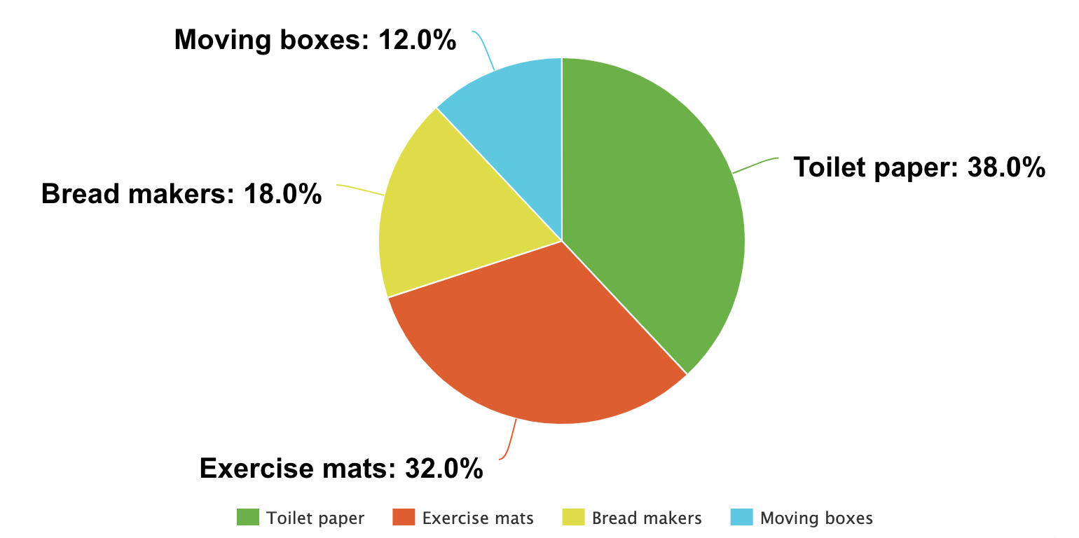
 Safari
 Android
 Talkback
 Chrome
 Windows
 JAWS
JAWS
 NVDA
NVDA
 Your plan might be changing soon.


 Included
 Not included